
Rounded or Square Corners?
by Cedar Studios • 10/12/2023
Web Design
Web design is composed of a thousand tiny details which are rarely seen but always felt. One of those details is “rounded corners vs square corners”—a debate that quietly rages on in UI/UX forums across the internet. If your designs look good but don’t feel right, read on.
History of the rounded corners debate
I’ve traced this debate as far back as the 80s when Steve Jobs and Bill Atkinson were disagreeing about the future of the Macintosh’s user interface.
”How about rectangles with rounded corners? Can we do that now?” asked Steve.
”No, there’s no way to do that. In fact it would be really hard to do, and I don’t think we really need it.” said Bill.
”Rectangles with rounded corners are everywhere! Just look around this room!” Steve said hotly.
And sure enough, there were lots of them. Like the whiteboard and some of the desks and tables. Then he pointed out the window. “And look outside, there’s even more, practically everywhere you look!”
He persuaded Bill to take a walk around the block with him, pointing out every rounded rectangle he could find.
”Okay, I give up”, Bill pleaded. “I’ll see if it’s as hard as I thought.”
The next day, Bill came in the office with a big smile and a RoundedRect demo to show Steve.
And the rest is history.
Rounded corners are everywhere
As per usual, Steve Jobs was right.
*coin clinks into the Steve-Jobs-Was-Right jar*
Look at Google’s original home page compared with today’s:
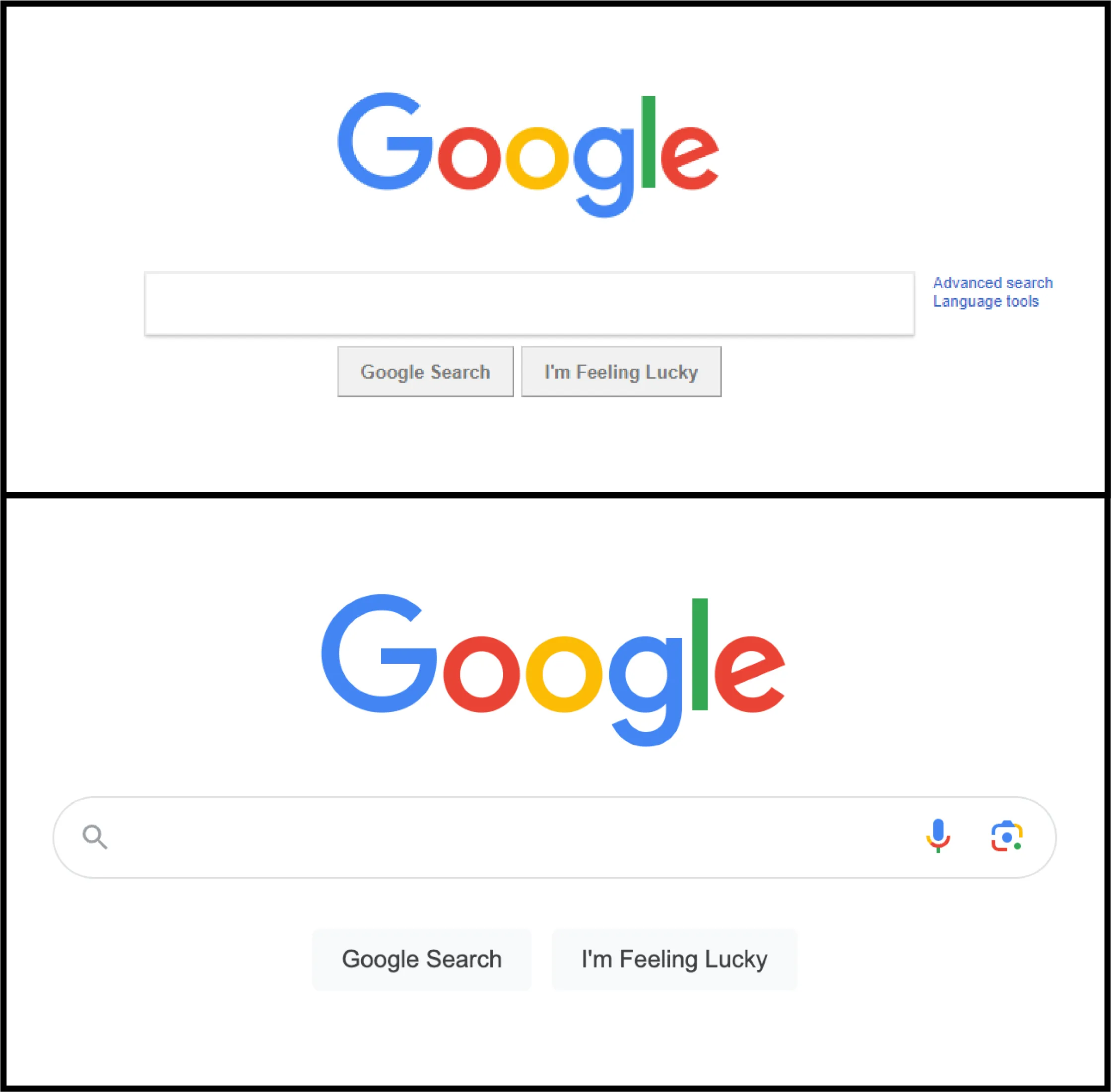
Note both the search bar and buttons are rounded now
Or take a look at YouTube’s new thumbnails.
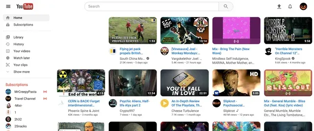
This one pissed off a bunch of nerds.
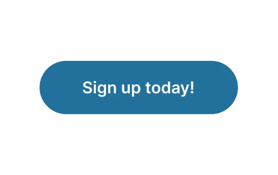
On just about every website these days, you will see rounded corners on images, cards, and buttons. Call-to-action buttons are often fully rounded:
Why are rounded corners so popular?
A common claim is that rounded edges are easier for our brain to compute.
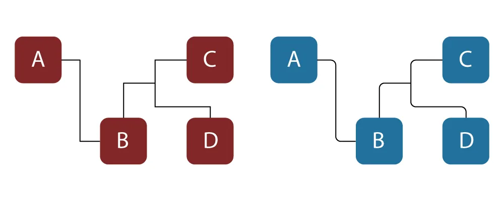
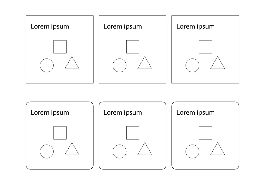
Notice in this flow diagram how your eyes stop to “visit” each point of the square points (left). Now look at the smooth diagram (right) and feel how your eyes travel in a fluid motion along the lines.
Now that you are aware of your saccades (eye movements), apply that to the below image. Notice how your eyes begin to trace the outside of the sharp cards, whereas your eyes are drawn inward to the contents of the rounded cards.
User research suggests that rounded corners are preferred to sharp corners and feel more inviting.
But keep in mind, rounded corners give a more modern and casual feel.
Websites in a more professional domain (e.g., law firm) tend to prefer sharp corners which have a more professional air.
INFO
For more on business branding, read Must-Haves for Small Business Website Design.
When to use rounded corners vs square corners
Rounded corners look best for cards and buttons. Let’s look at some real world examples.
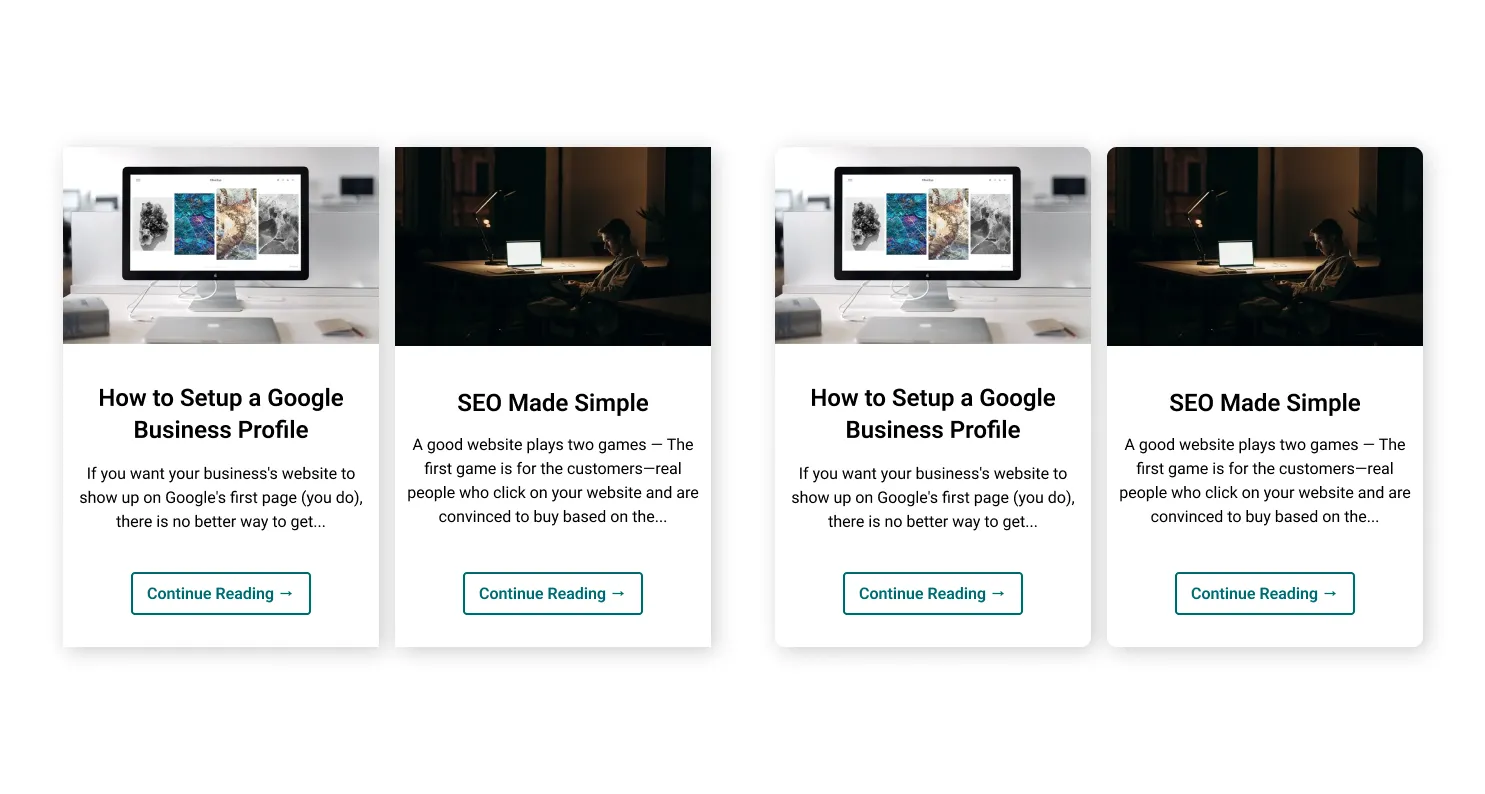
Square cards vs rounded cards
The rounded cards (right) are a little easier on the eyes and have better visual separation. Again, that’s because sharp corners tend to highlight what is around the object, whereas rounded corners draw the eye inward to the center of the object.

Square, rounded rectangle, and fully rounded buttons
Rounded rectangle buttons are quite common throughout user interfaces and web pages, with fully rounded buttons being the go-to for the CTAs (call-to-action).
Should square corners ever be used?
Square components still have their place. Specifically, user research reveals that square containers are preferred to rounded containers.
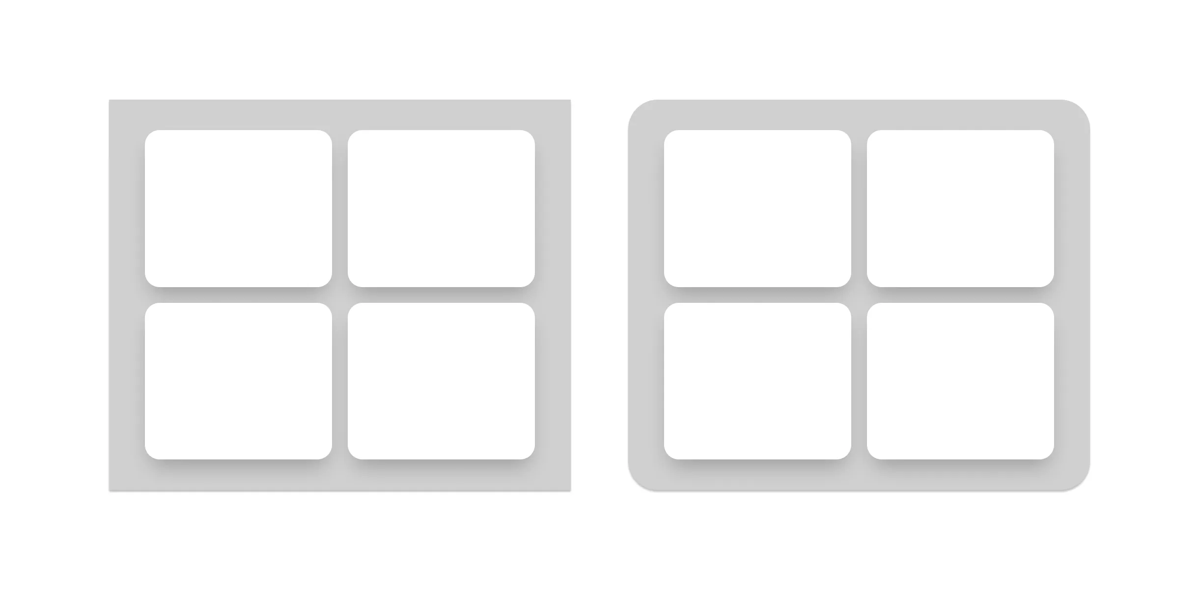
Square and rounded containers
Because sharp corners draw a distinction between an element and its surroundings, this helps the container stand out from the background. The rounded corners of the container on the right draw the eye toward the center of the container, distracting the viewer from each card as an individual.
Another use case for square corners is for more traditional websites (again, picture a law firm or an accountant’s website) and wherever your taste dictates. We recently made a website for a hair salon which, while modern in feel, includes square buttons as a stylistic choice.
While you should keep the basic principles of good website design in mind, always rely on your taste for a final design decision.
Bonus: Introducing the Squircle
In recent years, especially on iOS, we’ve seen the rise of the “Squircle”—a cross between a square and a circle.
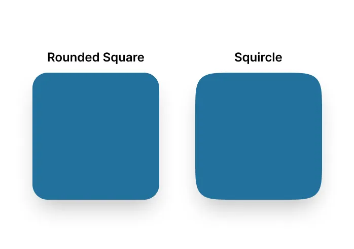
It’s subtle, but you can see that the corners of the squircle don’t round off into a straight edge like the rounded square. Rather, they round off into a curved line, giving the entire shape a more circular feel.
These shapes are especially popular for small icons, such as app icons on the iPhone home screen.
Conclusion
Rounded corners are here to stay. They work best for images and single components, while square corners work nicely for containers. However, the style of the website will always dictate the design. Have a look at our recent client, a hair salon website that strategically uses square buttons to contrast rounded images and floral patterns.
Again, if your designs look good but don’t feel right—the Devil is often in the details. Let us help.
