
Responsive Design vs Adaptive Design - 2024 Key Differences
by Cedar Studios • 1/29/2024
Web Design
In 2024, should your website be responsive or adaptive? The answer is almost always responsive. But if you aren’t sure why, let’s dive into the details.
Update: Want to see how we go about designing for mobile vs desktop? Watch our process below.
What Is Responsive Design?
Responsive design refers to a website’s ability to grow and shrink to fit all screen sizes, from small phones to 4k desktop monitors.
Several years ago, you may have noticed that many websites had two versions: a mobile version (often prefixed with an m, like m.website.com) and a “normal” (i.e., desktop) version on website.com.
These days, those m. subdomains have largely disappeared, as CSS (Cascading Style Syntax), the language that powers how a website looks, has grown increasingly responsive to screen-size changes.
Here is an example:
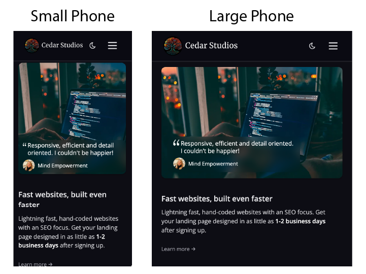
Notice how this banner gets wider between a small phone and a large phone’s screen size. This happens because I set the width in CSS to 100%, meaning as the screen size gets wider, so will the banner.
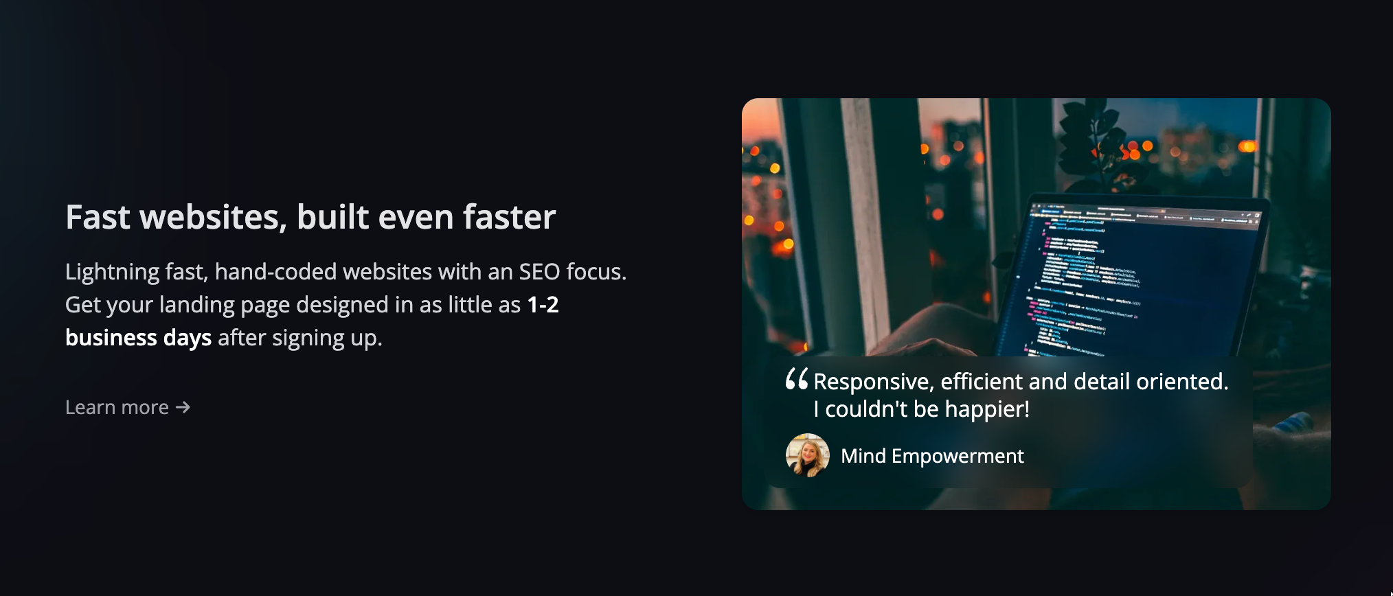
For desktop users, we used a “media query” to change the layout from vertical to horizontal:
Here’s what the CSS looks like:
@media only screen and (min-width: 1024px) {
	.container {
		display: flex;
	}
}
As you can see, we are rearranging the banner into a flex box, but only when the device’s screen size is ≥1024px.
In tailwind (what we prefer to write CSS in these days), this is even easier:
<div class="lg:flex">
	...banner code is here
</div>
That lg directive means the flex functional class will only apply to large (1024+px) screen sizes.
Thus, responsive web design means that your elements and layout is fluid across different devices and across different browsers sizes within the same device (think resizing a window on your desktop).
Mobile design principles
Recently, we found that 64% of our clients’ traffic came from mobile devices (particularly iPhones). That was true across all the different markets we serve.
Therefore, you will want to design your website with mobile users in mind first.
Fortunately, mobile design is simple. It’s all vertical.
Take this (desktop) design for example:
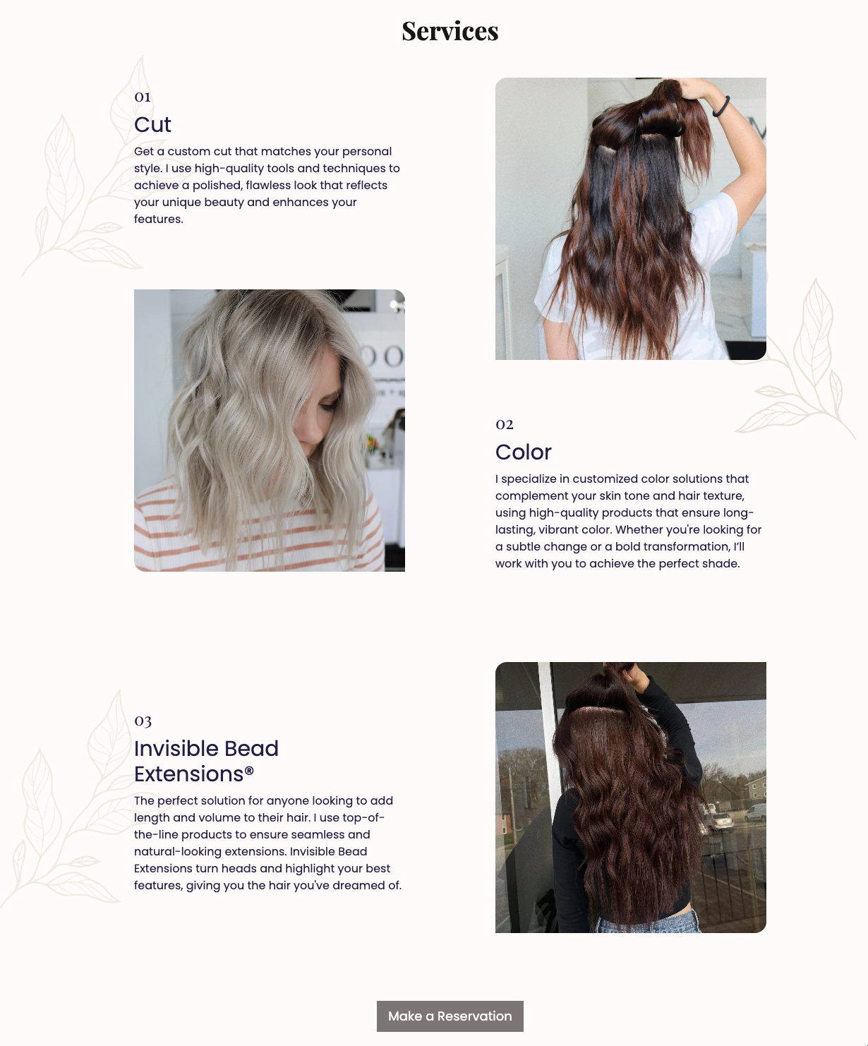
It has staggered and reversed elements, with flower embellishments on the sides.
On a mobile device, it is much simpler:

The complex arrangement is reduced down to a single column, and the flowers are removed to avoid crowding the design.
For a mobile layout, you will almost always be breaking apart design components and stacking them on top of each other.
Desktop design principles
Desktop design is where things get a bit more complicated. Unlike a mobile phone, the layout is horizontal, so stacking elements does not look as nice as airing them out.
However, simply lining design elements up left-to-right is not very attractive, either. You will need to play around with the placement until you get the right balance.
Take a look at these sections from CR Face Painting. Notice how the elements are neither perfectly vertical or horizontal in their alignment, but rather are placed on the page somewhat asymetrically.


Desktop-first design, mobile-first development
This is the philosophy we bring to every project. We design each website in Figma for a desktop computer first. In fact, many times we don’t even bother with a mobile layout—they are easy enough to design as you develop.
Development is another story. When you are coding the website, you want to start with the less complex mobile design, and add only the complexity that’s needed as the screen size increases.
This results in the least amount of code, which results in the fastest possible website.
What Is Adaptive Design?
Adaptive web design refers to create several distinct layouts that your website will display at different device widths.
Remember those media queries from before? For an adaptive design, you would define a range of media queries and design a layout for each width:
320 px
400 px
640 px
768 px
1024 px
1280 px
1440 px
Once your website loads with a given layout, it doesn’t respond to changes in screen width (like rotating your phone or resizing a desktop browser window) the way a responsive design would.
Key Differences Between Adaptive Design Vs Responsive Design
Here’s the main takeaway—responsive design is fluid across screen sizes, whereas adaptive design entails creating several layouts for screen sizes that you predict users will be using.
Importantly, the responsive and adaptive approaches be combined.
Remember the first example in the Responsive section? We not only let the image grow in size (responsive)—we also added a media query to adjust the layout for a desktop screen (adaptive).
We follow a similar process for all of our websites:
Design a great looking (vertical) layout on mobile
Grow the elements (responsive) until around the width of a small tablet (768 px) or laptop (1024 px)
Use a media query to switch to a horizontal layout
Following both approaches allows for the smoothest website with the least amount of code—making them faster as well.
SEO Considerations
Making your website both responsive and adaptive comes with some small SEO considerations, though they aren’t crucial.
Here’s the list of Google’s Core Vitals scores that pertain to website responsiveness and adaptivity:
Document doesn’t use legible font sizes
Tap targets are not sized appropriately
Displays images with incorrect aspect ratio
Offscreen content is hidden from assistive technology
So long as your font sizes and buttons don’t grow to small, and your images don’t grow apart from their original aspect ratio, you should be good to go.
Conclusion
Responsive websites look great on any size screen with minimal code. But for the mobile-to-desktop switch, you may need an adaptive element. The result? A lightning fast website that works on every platform.
