Live Look: Simple Website Design
by Cedar Studios • 11/29/2023
Web Design
Every element, button, and icon you add to your website is just as likely to frustrate users as it is to drive conversions. Sometimes, it’s best to keep it simple. Here, I take you through a very simple, clean website design in Figma. Watch or read along below.
Simple Website Design Tutorial
Here’s the video if you would rather watch than read. I also throw in a lot of Figma tips/tricks in the video.
And here is the finished product on Figma.
Below, I’ll break down each section, why it is important, and my thought process while designing.
Navigation
The first thing we will need is a navigation bar. I prepared a very simple logo for this.
 Next, I add in links to our relevant pages. We have found that the typical small business site in Cedar Rapids does well with a classic 5-page design:
- Landing Page
- About Us
- Services (potentially with subpages)
- Portfolio
- Contact Us
The landing page and service page(s) tend to be the ones that rank the highest, whereas the about us and portfolio page build customer trust. The contact page contains a simple email form.
TIP
Service subpages can be a great place to add extra, researched keywords—and eventually—to drive ads to.
Here, we ended up choosing “Sign up” as the main call-to-action (CTA). It is styled as a button to set it apart and denote utility.
In Figma, this is extremely easy. Simply create an Auto Layout around the text, give it some padding (24px horizontal, 8px vertical), and give it a rounded stroke (2px).
Finally, I made the current page (i.e., Home) bold to indicate it is active. This will change as we navigate around the site.
As you can see in the video and in the design file, there is a nice shadow coming down off the navigation bar.
Hero
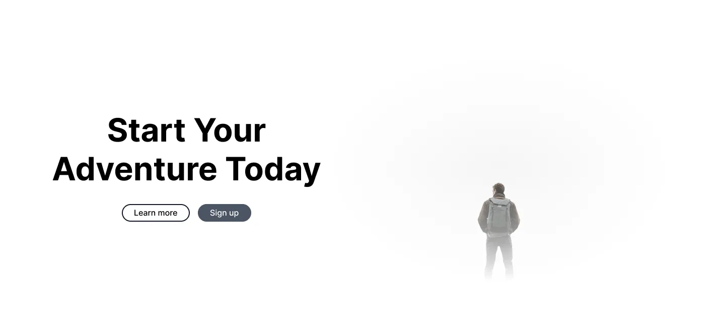
The first section that customers really see is the Hero section.
These can get complicated quickly, but here we wanted to keep it simple.
And really, it is best to keep it simple in all cases. The Hero section is where you:
- tell your customer who you are
- introduce the single CTA
Here we have some simple, enticing text.
Typically I would add a very short (1-2 sentences) and low-cognitive load paragraph underneath the bold text indicating what the company does.
In this case, this feels like a design for a travel company or a ski resort, so let’s do something like:
Break free from routine and explore the real you at any of our world-class destinations.
That was just off-the-cuff, so nothing glamorous. But it appeals to both pain (routine, responsibilites of life) and social position (world-class destinations, expensive, prestigious)—so with some tweaking it should convert people looking for a vacation.
Under that, note that there is a simple button (Learn more) which will just take users down the page to the About Us section.
The real CTA, which is set aside in a primary color, is repeated—Sign up.
Next, I did what all web designers do and grabbed a stock image for the Hero section. I went to Pexels and filtered my results for the “white” hex code to match the style of the page.
Finally, I applied a white, radial blur around the image to soften the edges, so it sort of “melts” into the background.
About Us
Next, we want to establish a connection with the customer and personalize the brand. An About Us section is great for this.
I again grabbed a couple stock images, but if we had a picture of the business, including employees, I would use that here.
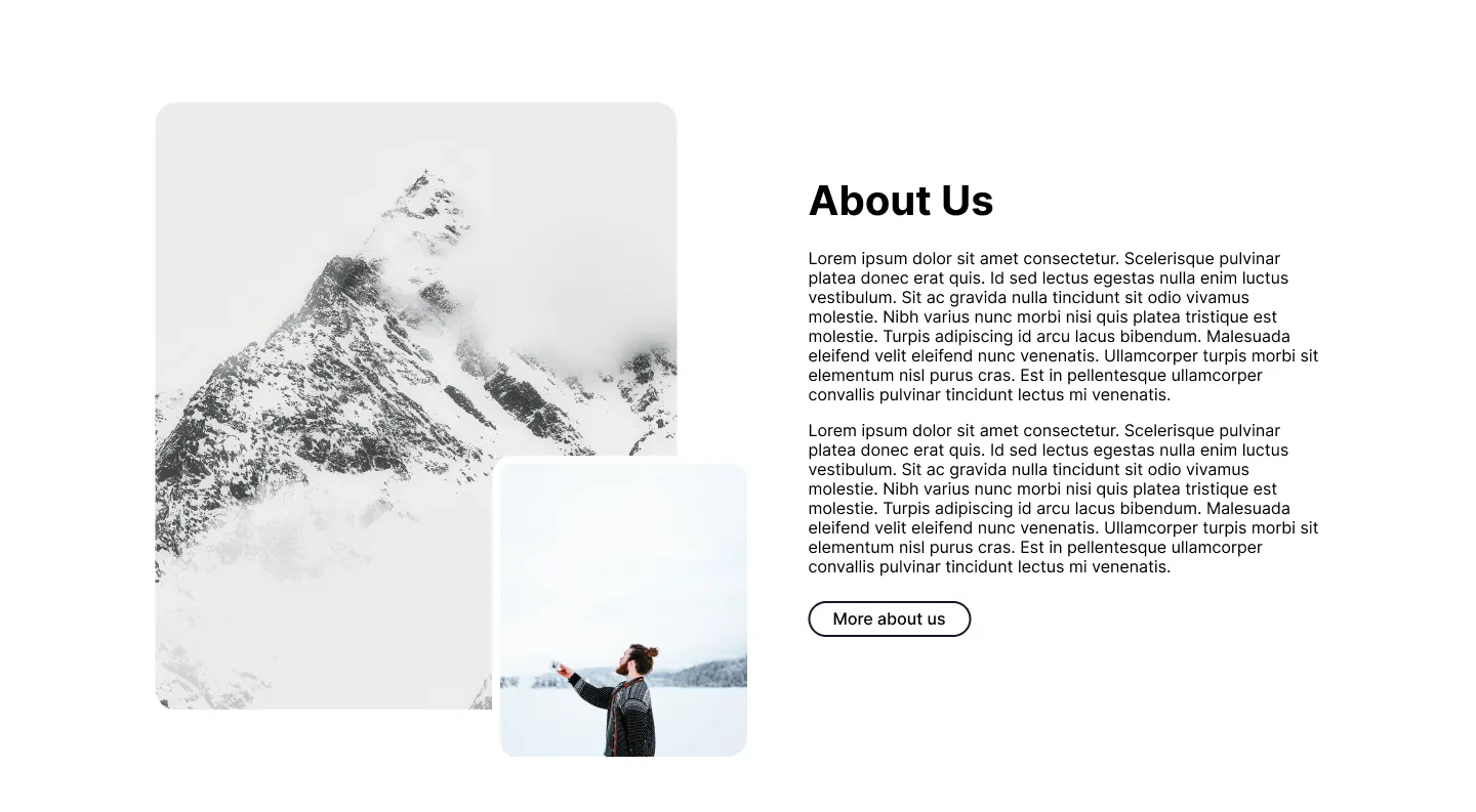
These pictures have slightly rounded corners, which give a softer look. I ended up “absolutely positioning” the second image just to break up the design a bit and give it depth.
On the right-hand side, we have the h2 header for the section, some text, and a button that will lead to the “About us” page itself.
Note: I use a secondary color button, rather than a primary color, because I want to save my primary color for my main CTA.
INFO
Use ONE h1 tag to denote the main purpose of the page. Use h2 tags to denote major sections. This helps Google crawl and make sense of your website.
Together, these images and text form a Side-by-side section, which is a common element of website design.
Service Cards
Next, we want to discuss the services and link to some service pages.
For small businesses, this is where you will get many of your ranking keywords. It’s also what your customers are searching for, so getting these pages to rank is important.
They also tend to convert well, so ads should be driven to a service page and not the landing page.
Here, we made three “cards,” each one with some short text beneath a header.
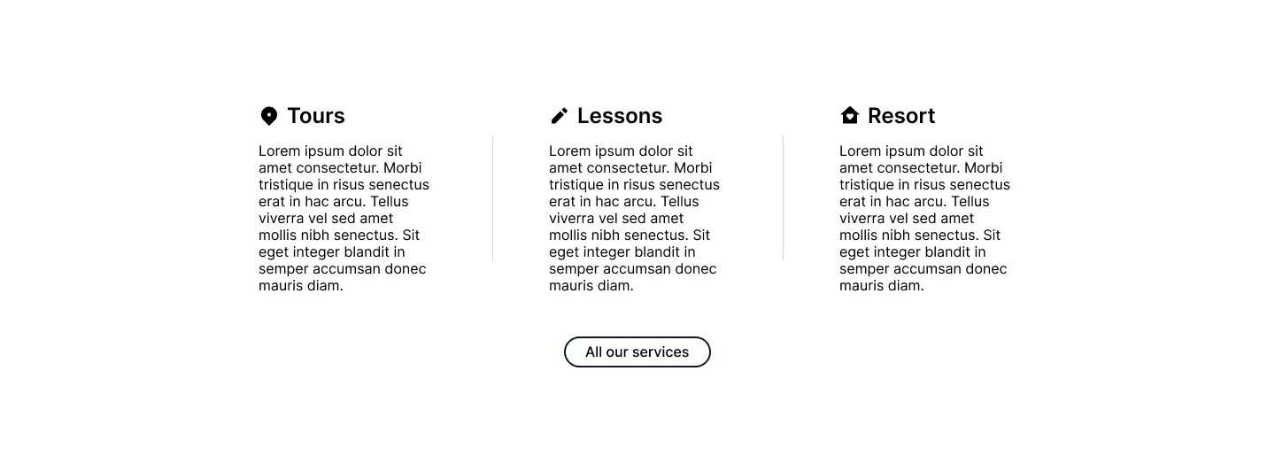
For additional flair, I added a stylish icon to each one. I got the icons from Iconify, which is a one of my favorite free resources for both website design and development.
Finally, we have another button that will link to the main services page.
Reviews
Normally, I would add more sections to the website, like a couple of service Side-by-sides, an FAQ (extra keyword goodness), etc.
But we are keeping this simple, so I’ll go straight to my website endgame:
- Reviews
- Call-to-action
- Footer
Social proof is a major conversion factor. So much so that I place them at the end of a website so that users remember all the nice things people say about your small business.
Consider the serial position effect—people remember the first and last things they read in a series of information.
A website is no different.
At the top, we are showing the Hero (first impression and broad-strokes of what you do) and services.
At the bottom, we are showing the testimonials.
Most of the information in the middle of the website will be skimmed, so we’ll put our highest converting assets at the edges and stuff keywords into the middle.
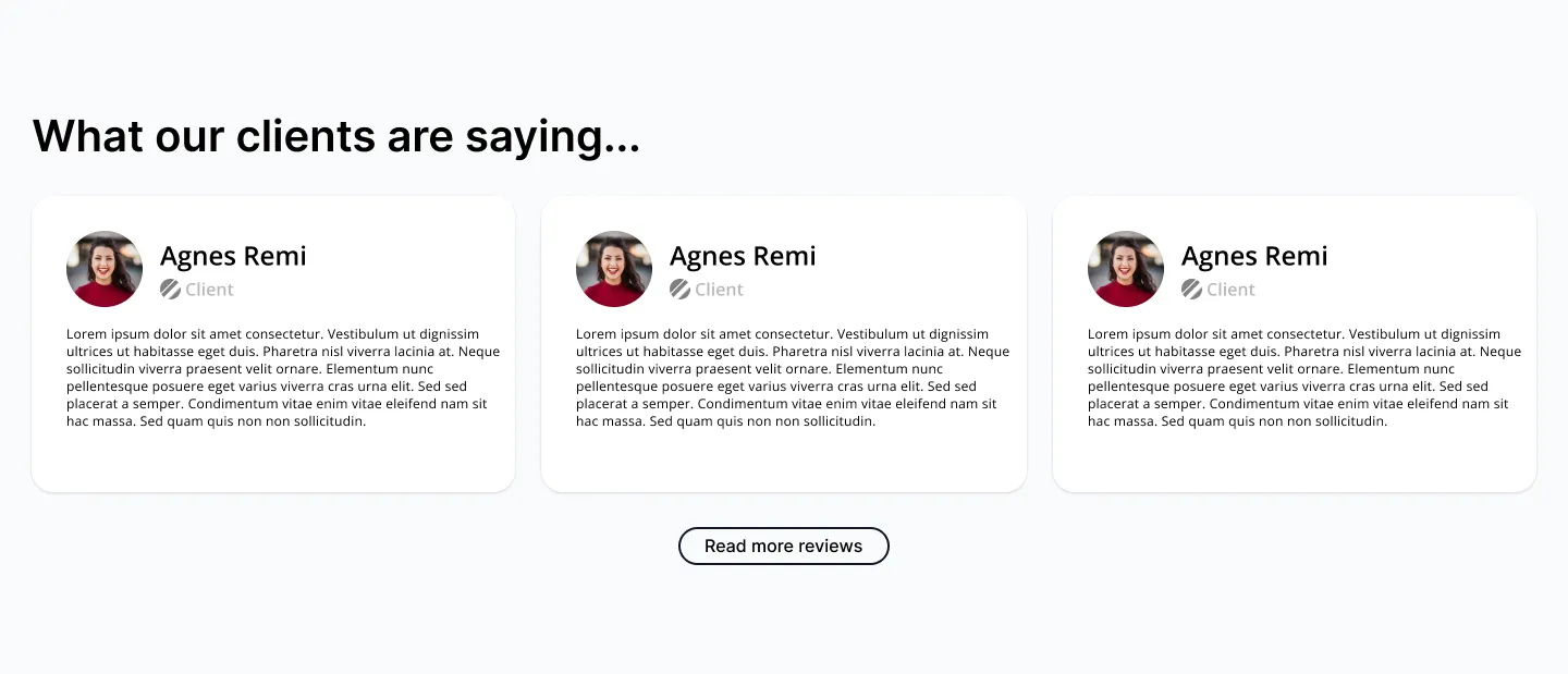
Here, I “cheated” and grabbed a nice looking review card template from Figma’s community.
Whether purposefully or accidentally, all design involves borrowing from others. Here I explicitly wanted to find an existing design to work from.
I ended up tweaking the design and formatting the whole thing with Auto layouts, and it turns out pretty nice.
I added another h2 tag at the top and another secondary button below.
Call to Action
The final section I want customers to see (like the navigation bar, no one really sees the footer) is the CTA.

Again, we want this simple and punchy. Low cognitive load. Action words.
This section is a must-have for small businesses.
You need to tell your customers what to do and exactly how to do it. Here, we want the customer to sign up for an account.
This section was looking a little bare, so I added a snowflake to the background. It’s very light, but it keeps the design from looking too flat.
Footer
Finally, we arrive at the footer.
Like the navigation bar, everyone glances over it, yet it is crucial to make this simple and intuitive. Nobody likes wrestling with an unintuitive website. Instead, they just leave and go to a competitor…
I repeated some elements from the navigation menu here, including the logo (which I blew up) and the page links.

I also included some links to social media profiles, and for a Cedar Rapids small business website, I always like to include a phone number, location, and perhaps email address.
At the bottom, I added a copyright in small text. This is also a good spot for legalese pages like the Privacy Statement or Terms and Conditions.
Conclusion
Here, you watched (or read) me design a very simple website in about 40 minutes. This is the exact process I take with my small business clients, except with many more iterations and more attention to copywriting.
If you want a simple, clean website design for your Cedar Rapids small business, send us an email.


