
How to Design a Website Footer the Right Way
by Cedar Studios • 1/13/2024
Web Design
What is a website footer? A website footer is not just a bookend for your website. It is an opportunity to make your user’s life better—or to make it hell. Your design decisions here leave the final impression on your user, so design wisely!
Why use a website footer?
Let’s start off with why would you need a website footer in the first place?
Because everyone has one? That’s not how we operate at Cedar Studios.
Most websites have far too much going on. Images everywhere and no white space.
A website is like a long-form sales letter. You want the design to enhance the message and break up long paragraphs of text. But you don’t want the design to distract the user from the messaging.
So, is a website footer necessary?
In this case, yes. Here’s why.
Aesthetics and utility of a footer
Wouldn’t it be weird if your website just sort of…ended?
Just like if a book ended before the last chapter. It would be jarring.
Here’s an example from one of our recent clients.
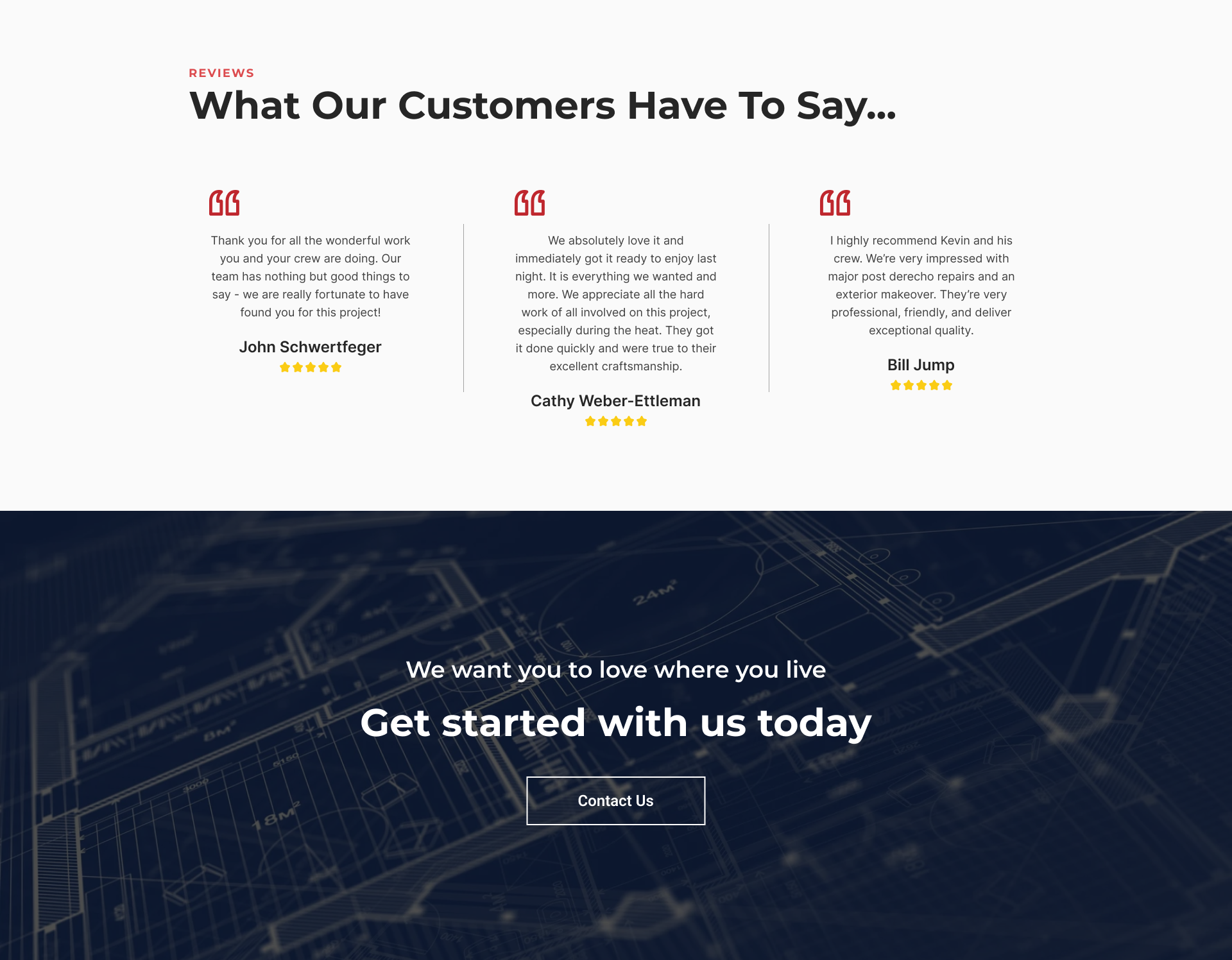
So we see that some of their clients have some nice words to say. And now there’s a call-to-action.
But what if we want some contact information? Wait, what was the business name again? And do I have to scroll to the very top just to go to another page?
Here’s that same design with the footer left on:
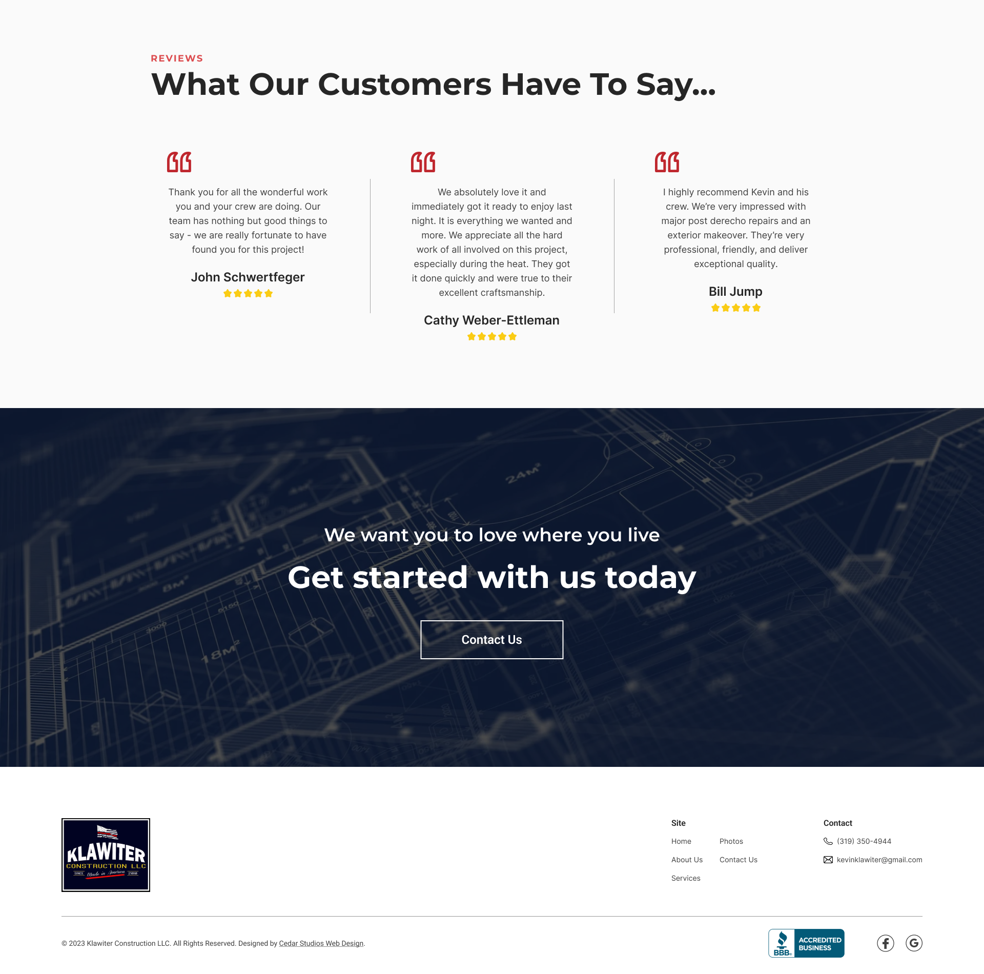
Ah, that’s better.
Now there’s a “bookend” to the website. If I scrolled up, you would see that the footer is similar to the design of the navigation bar at the top:

The color is the same, the logo is in the same place, and the links and phone number are there as well.
This becomes even more apparent when you scroll to the bottom and see the (sticky) navigation bar juxtaposed with the footer.
Your brain automatically associates these design components together.
What’s more, because you have spent thousands of hours navigating other websites, your brain automatically classifies the navigation bar and footer as the primary tools with which you operate the website.
INFO
See “Jakob’s Law” from our post, The 10 Principles of Good Website Design.
So, while many websites do include redundant design elements just because “everyone else does it,” the website footer is an exception.
It needs to be included in any website you build.
What to integrate in a website footer?
What belongs in a content footer? Besides branding (i.e., your logo), you are going to fill your footer with useful links for the user.
You will also do your legal due diligence here.
Contact information
First, make sure you have your contact information repeated in the footer. Leave a good phone number and email.
Pro tip: format these so that clicking the phone number starts a call, and clicking the email starts an email. You can do this is plain html with the <a> (anchor link) tag.
<!-- Phone number -->
<a href="tel:3195550000">(319) 555-0000</a>

<!-- Email -->
<a href="mailto:info@business.com">info@business.com</a>
Physical address
If your business has a physical location, put the address here.
You have two options for this:
Make the address a link to google maps (with your address saved).
Include a small embed of the map that users can click on.
Here’s how to do #2:
Go to Google Maps. Search for your business.
Click on the Share button on the left-hand panel.
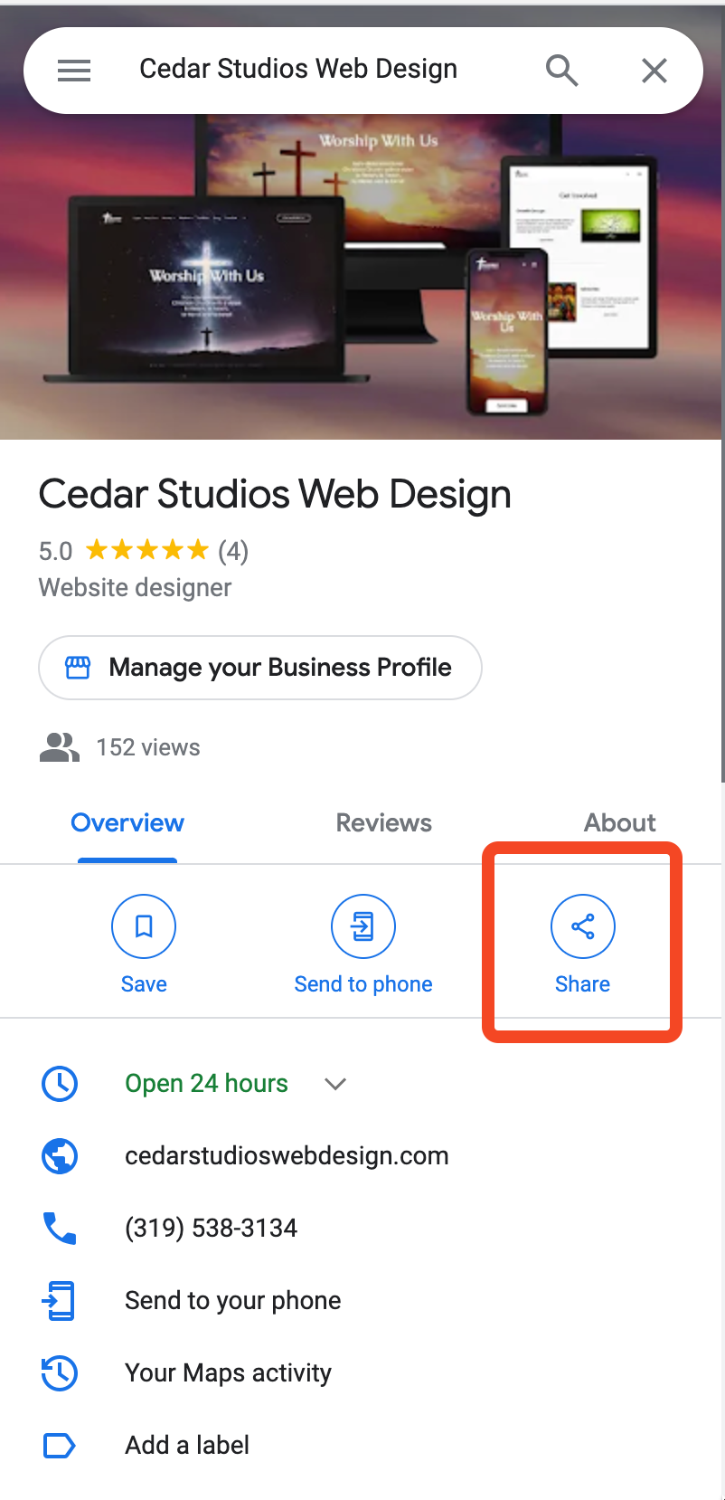
Then, click Embed a map and set the size to Small.
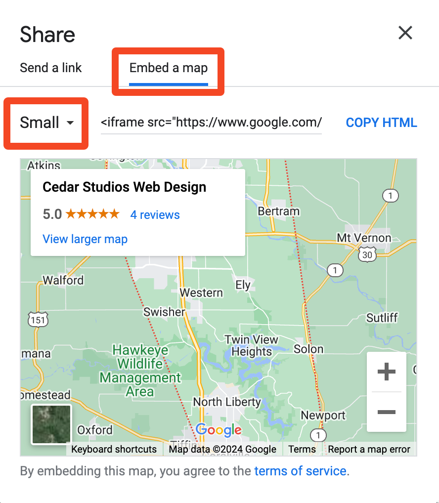
This will give you some HTML to copy (an <iframe>) that embeds a fully functional map in your footer.
Your users can drag the map to see the surrounding area or click to get directions.
Sitemap and links
A website’s footer is a great place to reiterate your links from up top. This gives the user a chance to check out your services page, your photo gallery, etc. if they aren’t quite convinced to buy just yet.
This is pretty simple, just repeat the links from the top navigation bar.
If one of your links has a dropdown, you can add a collapsible menu like we do on our website.
However, it’s perfectly fine to omit this and have the “Services” link point to your main services page, or if you don’t have a top-level page, to the first service page in the dropdown menu.
Copyright Information
This is pretty straight-forward. Add a copyright statement so that you can enforce legal action if anyone were to copy your website assets.

A couple small caveats:
The © symbol may not show up correctly in all browsers. Use the html-safe version:
©.If you really want to set-it-and-forget-it, you can automate the year with a little JavaScript
<p>© <script>document.write(new Date().getFullYear())</script> [Company name]. All rights reserved.</p>
This will update every year to keep your copyright notice up-to-date. Nothing screams “I’m out of business” like a copyright notice from 2012 on your website’s footer.
Supporting Documents: Privacy Policy, and Terms of Use
For some businesses, you’ll need supporting documents such as a Privacy Policy and Terms of Use page.
If you have these saved as a .pdf, you can just add them to your website’s public/ folder and link directly to them.
<a href="/privacy-statement.pdf">Privacy Statement</a>
Clicking on that link will automatically open the browser’s PDF viewer (all modern browsers have one now).
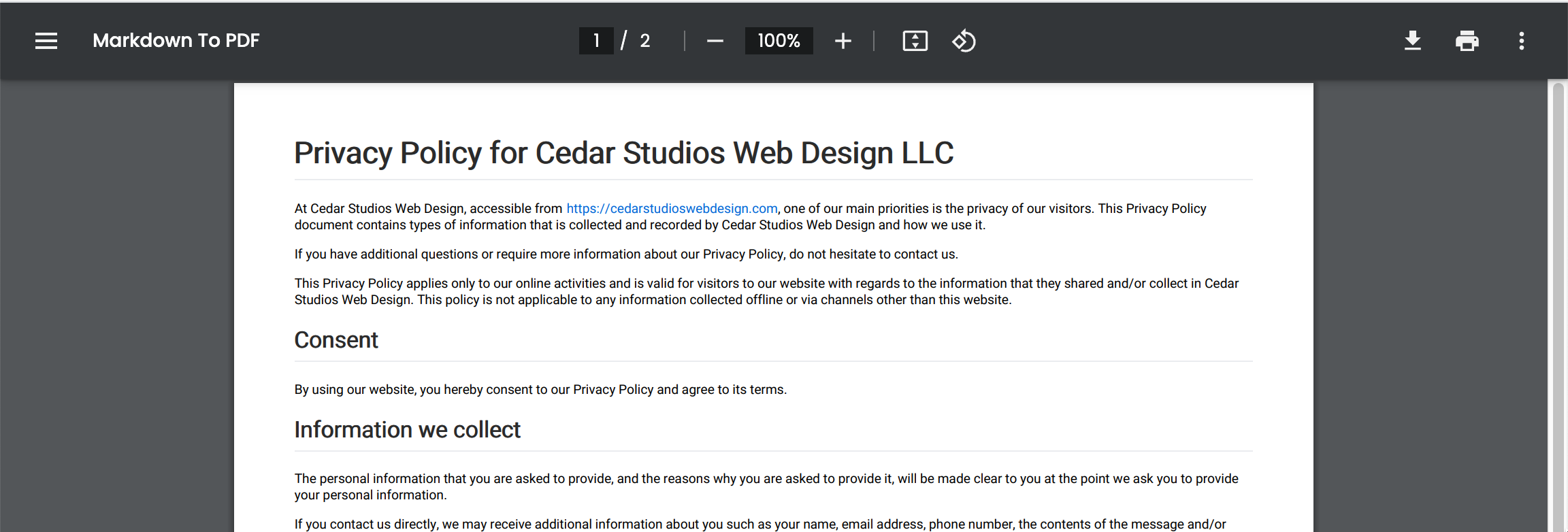
It’s that easy. Gone are the days of trying to host PDFs on your own. Just link ‘em.
Legal Information
Finally, you’ll want to put any additional legal information or supporting documents.
For a recent client, we added a Good Faith Estimate for her services.
Footer design tips
Design-wise, footers are pretty simple. In fact, the only real way to shoot yourself in the foot here is to overdo it.
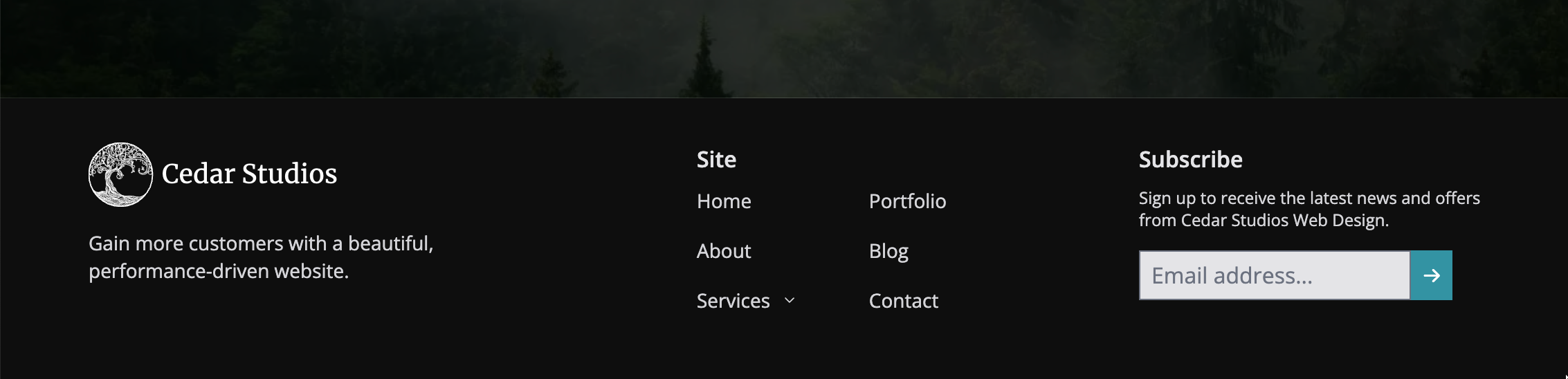
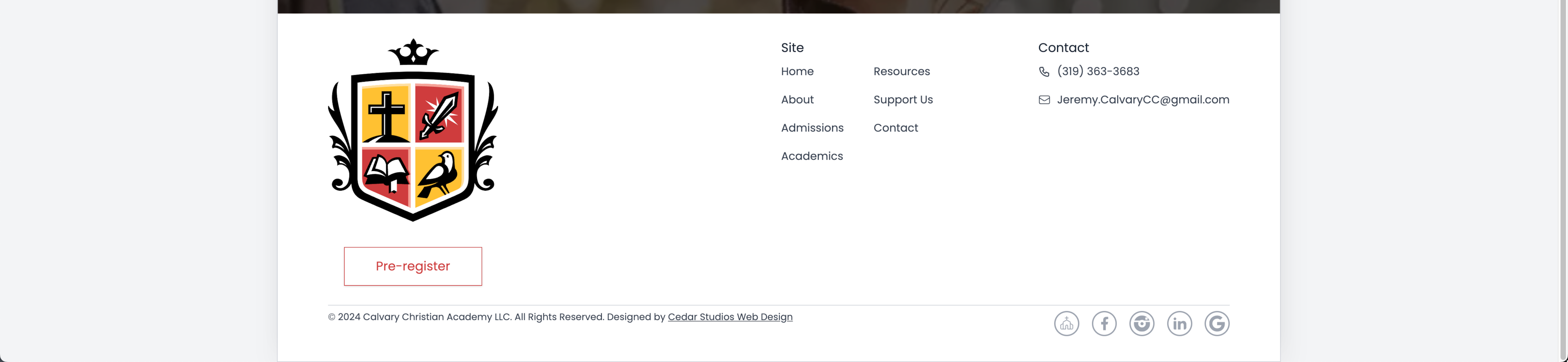
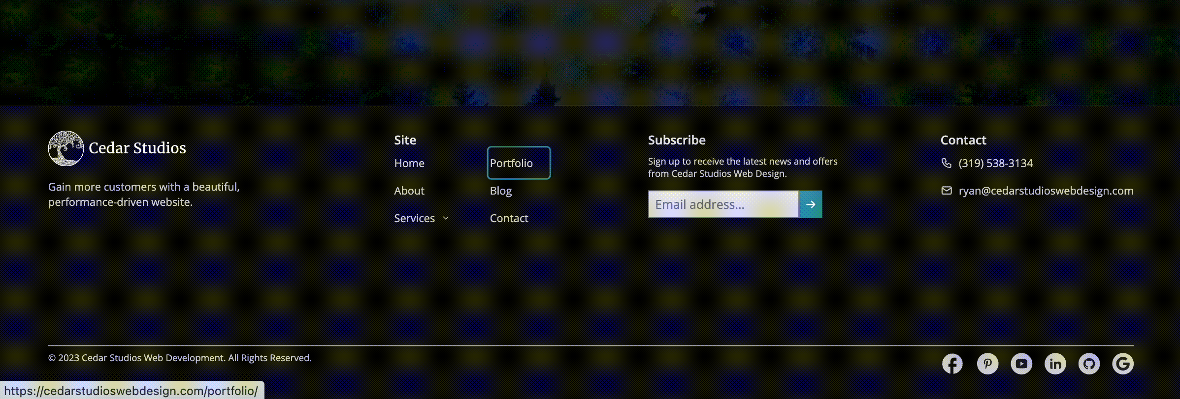
Here’s an example of a footer style we employ often.

First and foremost, it is a dark layout with light—but not white—text. This is important because the footer should not distract from the rest of the website.
INFO
Learn more about balancing black-and-white contrast.
As we mentioned earlier, the footer is primarily for utility. It should have a subtle but clear design. Fading into the background until the user is ready to interact with it.
Here are a couple more footer designs so you can get the pattern:

For Business Websites
You will notice that there are a few repeated elements across each of the footers. Those are:
the logo, which further establishes brand identity
contact information
internal links to the most important pages
copyright notice
social media icons with links
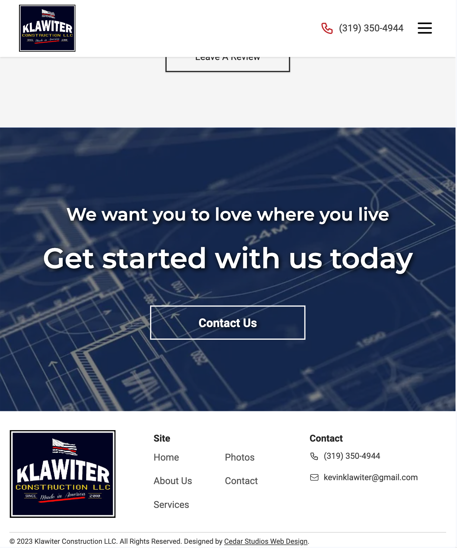
In the last footer example above, we have a dedicated call-to-action button underneath the logo:

This is quickly becoming a favorite design pattern of ours. Not only does it give the user another chance to click the CTA, it establishes a relationship between the branding and the intended action of the landing page.
Mobile design
Based on our analytics, most of our clients get ~67% of their traffic from mobile devices.
INFO
Our clients’ traffic is mostly from iPhones, using an even-mix of Safari and Chrome browsers.
Therefore, it is crucial that your website design takes mobile users into account.
For the website footer, this is pretty easy. Just stack the elements vertically.
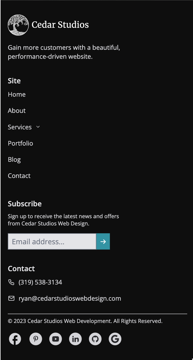
Make sure to give the footer links enough space so that the user can comfortably click them.
You’ll also notice we employ a little visual hierarchy by offsetting the section titles (i.e., Site, Subscribe, Contact) in a semibold text in a lighter color.
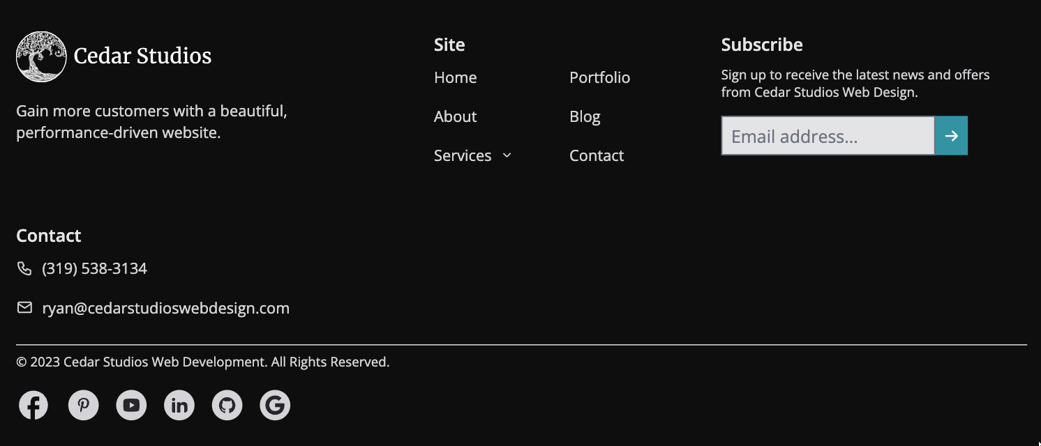
As the device width increases (i.e., for a tablet), simply allow the design to grow wider.
Accessibility
Lastly, make sure your footer is accessible for users—including those that use screen readers.
You can do so by making sure any buttons have aria-label’s, your text is small but readable, and you are able to “tab through” the different links without using a mouse.
Don’t miss the opportunity presented by your footer
Your website’s footer is your last chance to influence the user into clicking through your website (preventing a bounce from Google’s perspective), calling your phone, or clicking your call-to-action button.
It is also another opportunity to influence your user with your logo, colors, and other branding, and leave a lasting impression.
Finally, there’s a negative opportunity to be aware of! If your website’s footer is sufficiently flashy, irritating, or devoid of useful links, you will leave a bad impression and perhaps lose a future customer.
Conclusion
What is a website footer? It is an important component of a website whose primary function is utility. A subtle, responsive, and accessible design can help your footer live in the background until the exact moment your user needs it.
Do you wish your web developer put this much thought into the details of your website? Sign up to get started building a website that you are proud to show your customers.
