Breadcrumb Navigation: Best Practices & Examples
by Cedar Studios • 1/19/2024
Web Design
There is nothing worse than a website with a confusing navigation. Unfortunately, laying out your sitemap in its entirety in the Navbar isn’t always an option. That’s where breadcrumbs come in. Learn more about this subtle tool that can save your large website from becoming a navigation disaster.
What is a Breadcrumb Navigation?
Breadcrumb navigation, sometimes called a breadcrumb trail, is a navigation tool that allows the user to see which pages they’ve visited.
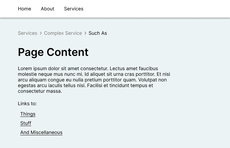
Here’s an example from Calvary Community Church:

The church icon represents the home page. The People link represents an internal page, and Jeremy Higgins is an internal page one layer deeper.
So, think of breadcrumbs as an alternative to very complicated menus.

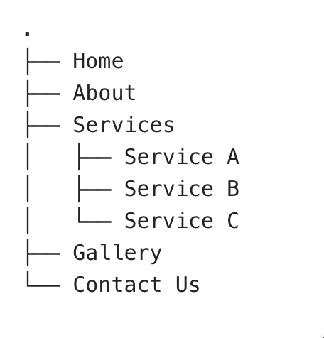
Several, nested dropdown menus are not only ugly, they are confusing to use.
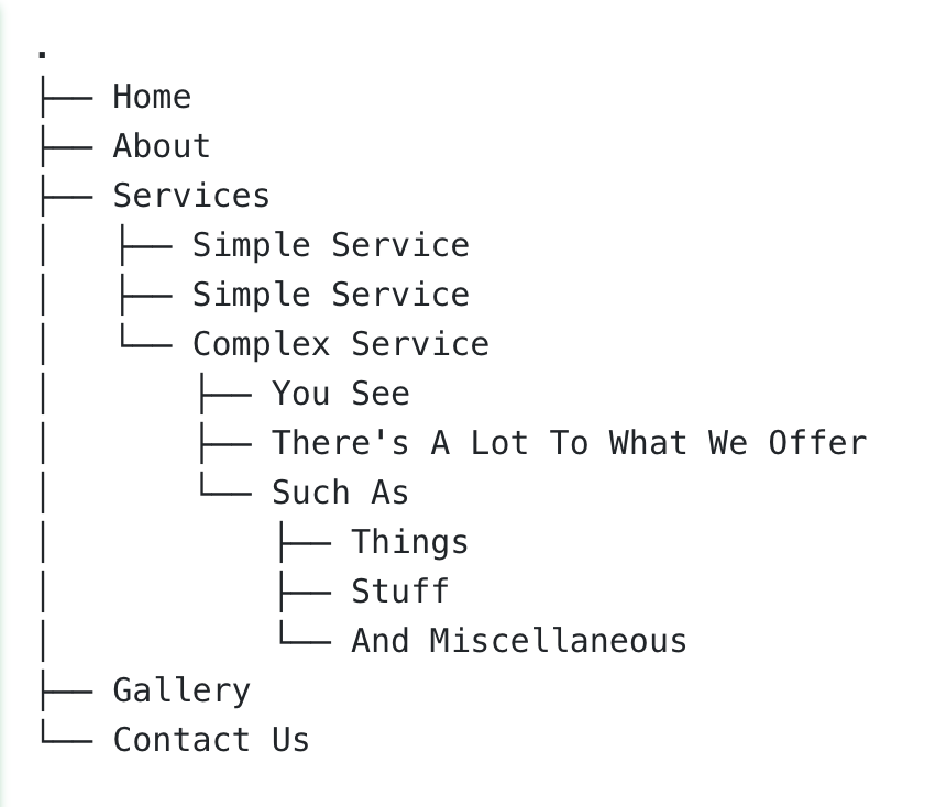
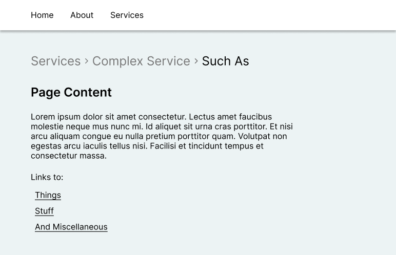
This gets even more difficult when the user is on the “Such As” page and needs to remember how they got there.
Why use a Breadcrumb Trail?
Navigation breadcrumbs would have solved the problem above.
By taking the complexity out of the navigation bar at the top, we made it less overwhelming and thus more handy for the user.
As the user clicks through the pages, the breadcrumbs let them know where he is. Related pages (in this case, Things, Stuff, and And Miscellaneous) are only shown when the user comes across them organically.
Thus, breadcrumbs are not only useful to show the user’s location, but also to reduce complexity (i.e., additional page nesting) until it is necessary.
TIP
Never use a breadcrumb menu as your website’s primary navigation menu. A Navbar should always be your go-to, with breadcrumbs as a backup to reduce complexity.
This helps keep the cognitive load of your website minimal and encourage exploration.
When to avoid using breadcrumbs
You don’t need to use a breadcrumb trail when your website has no nested pages.

Here, breadcrumbs would be redundant, as each page would simply have a link back to Home. And that link is already visible on the navigation bar at the top of the page.
If you have a single level of internal page nesting, you probably don’t need breadcrumb trails.
Here, the Services subpages would lead you back to the main Services page. But again, that will be easily visible from the navigation bar at the top of the page.
You’ll likely want to use breadcrumbs when you have more than one level of internal page nesting, like in our first example.
This site structure or site hierarchy is too complex for your user to intuit—so we would want to drop a breadcrumb trail here.
TIP
Read Designing Your Website’s Architecture to setup your site structure StylePropertyMapReadOnly.
Three types of breadcrumb trails
So far, we have only seen one type of breadcrumb navigation. However, there are three that you should be aware of.
Page-based
This is the most common type of breadcrumb, and the type we have been considering to this point.
Breadcrumbs denote the website’s hierarchy, and which pages you need to travel through to get to the current page. (You may also see this referred to as “hierarchy based breadcrumbs.“)
In computer-science speak, this is a tree and you are being shown a path from the root to a leaf.
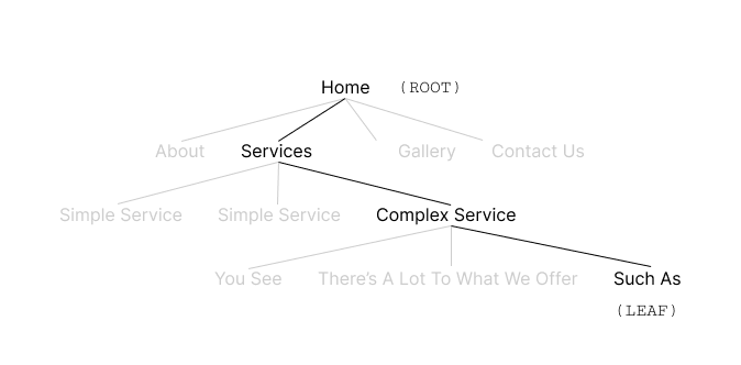
Again, this is the most common breadcrumb configuration, and therefore, it will be the most familiar to your users.
INFO
Jakob’s Law: Your user’s spend 99% of their time on other sites, and want yours to work the same way the other sites do.
For more, see The 10 Principles of Good Website Design.
Category-based
Breadcrumb trails can also be constructed by category—for example, in a blog.
Let’s pretend you have a blog about nutrition. Perhaps it is broken down into categories, like cooking; and then into subcategories, like cast-iron cooking. In this case, you can construct a breadcrumb navigation which shows the user which category/subcategory the current page belongs to.
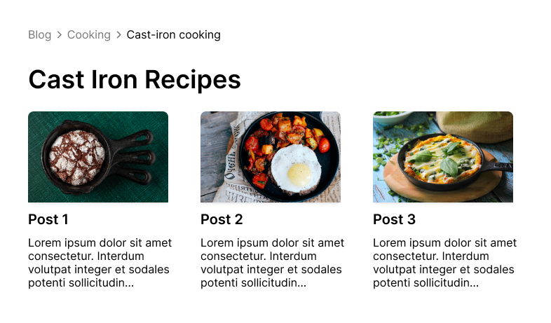
This breaks the traditional model of breadcrumbs by using an abstract hierarchy (categories) that may or may not match the page’s actual navigation hierarchy.
So make sure to use this breadcrumb type only when it makes sense.
Path-based
Finally, a breadcrumb menu can be constructed based on where the user has navigated previously. This is perhaps the least common type of breadcrumb navigation you will find, and it is rarely necessary.
As an example, if your user started at the Home page, went to the About page, went back to the Home page, and then ultimately went to the Contact Us page, their breadcrumbs would look like this:

As you can see, there can be duplicate entries, because we are tracing where the user actually navigated.
Of course, this may be the most accurate interpretation of the term “breadcrumbs,” but it can also be very confusing for users.
Why? Because people are used to breadcrumb links that are unique. Here, the two Home pages do not represent unique pages.
Furthermore, this trail of breadcrumbs is already implemented in the browser—it’s how your back button (and browser history) works.
So—don’t reinvent the wheel, and don’t use path-based breadcrumbs unless you really need to.
Design a Breadcrumb Navigation
Let’s take a look at our options for designing a breadcrumb navigation menu.

One option you have is to reduce the color on all pages but the current page. On the bottom, you can see that the previous pages are grayed out.
TIP
Add a nice touch by having a gray breadcrumb link turn black when you hover over it.
Another option is to play with the icons. Read Where Do Web Designers Get Their Images? to learn where you can download great icons for free.

Here we use a “home” icon to represent the homepage. This is about the only substitution you should make (an exception may be a shopping cart for a checkout page).
If you turn all of your breadcrumb links into icons, your users will have to spend time deciphering your hieroglyphs—turning your convenience feature into a nightmare.
Notice: we also changed the arrows on the bottom option. You could use any style of arrow, or even an ellipsis (…) to separate your pages.
Breadcrumb design mistakes
There are two major breadcrumb design mistakes that are frequently made.
Implementing a breadcrumb navigation on a website that does not need one
Making the breadcrumb links too large and obtrusive
See how this design drowns out the page’s text, and even the Navbar at the top?
Always keep in mind—breadcrumbs are a convenience, and they should always supplement a Navbar, rather than compete with or replace it.
Conclusion
A breadcrumb navigation is a great tool to supplement your website’s primary navigation, especially with a website hierarchy that is complex and deeply nested. Take care to design your breadcrumbs navigation with subtlety to avoid confusing your users rather than helping them.
