
Black and White Website Design
by Cedar Studios • 12/23/2023
Web Design
Although a little old-fashioned, black and white is a timeless combination and—done correctly—makes for a stunning website design. The color scheme enables comfortable reading of prose and is easily accented with a primary color in the most critical areas. Let’s go through some do’s and don’ts of black and white websites.
When is a black and white website appropriate?
While it can seem like a branding mistake to go with a “boring” black and white website theme, this classic color combination can really make the colorful elements on your website come to life.
As we’ll see in the later sections, black and white websites can feature stunning designs and a use of lighting that other designs simply can’t achieve.
Here’s a sneak peak at a couple designs you’ll see in this post:

Although not every design is strictly black and white, we will cover when to follow and when to break the black and white color scheme for maximal effect.
Black text on a white website
Placing black text on a white website is the obvious starting point. Like a book, the high contrast makes this color combination easy to read and can make the visual elements of your website far more visually striking.
Most common black-on-white mistake
The most common mistake made here is using pure black and pure white.
Contrary to what you might believe, there is such a thing as too much contrast and it can easily give readers a headache before they can read very far into your website.
This is the opposite of what we want, especially if we are going for a content-heavy or text-based website design.
Instead, we can try a lighter black for the text, or a darker white for the background. Here are a few combinations:
Pure white with dark gray text

In this example, pure white (#fffff) is used as a background, while a very dark gray (#262626) is used for the header. An ever-so-slightly lighter gray (#404040) is used for the body text, which gives additional contrast between header and body. This promotes visual hierarchy between the header and body text.
This color scheme will be easier on your readers’ eyes than pure black text on a pure white background.
Cream-white with dark gray text

A light cream color scheme (#fffefa) still gives a black-and-white feel, while reading more comfortably—like a book. Be sure to use a very light color, otherwise your entire website can end up looking yellow on some screens.
Blue-white with dark gray text

A more popular color scheme these days in a very light blue or teal. Here is the dark gray text again on a very light blue (#f8fafc) background.
In fact, this is the color scheme you are reading right now if you have the website set to “light mode.”
White website examples
Our recent post demonstrates a white website with (mostly) black text and accents. There is a bit more “blue” to this website, however.
Avalanche
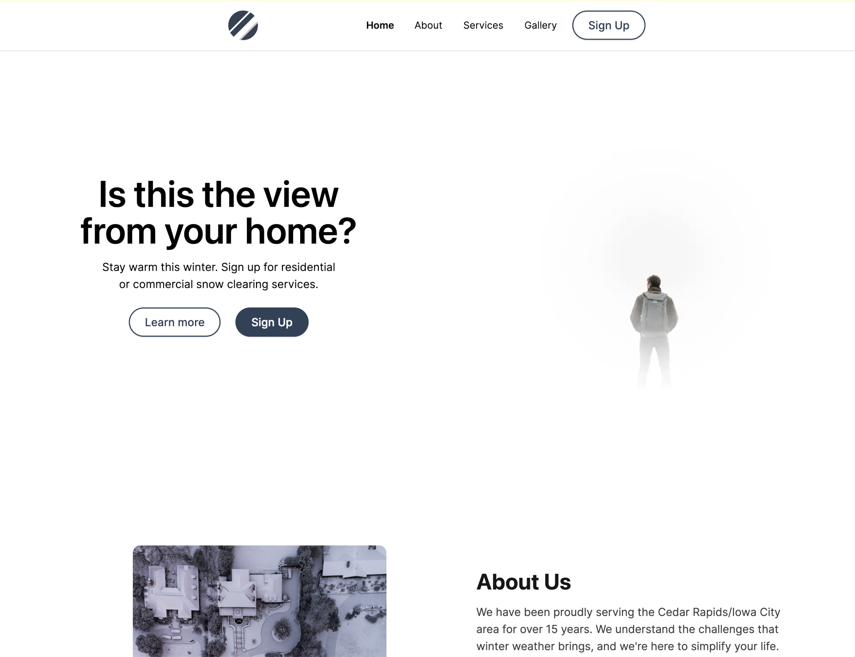
Here is a sample from our latest client, Mind Empowerment. Though the entire website is not in black and white, the internal pages are written in dark gray text on a light blue background, as discussed above.
Mind Empowerment

White text on a black website
For websites with dark mode, and for a lot of SaaS websites these days, a black background with white text is a popular topic. Many of the same principles as a white background apply here as well, including the most common mistake:
Most common white-on-black mistake
Again, the most common mistake for a black website with white text is too much contrast.
Pure white text on a black background can be difficult on the eyes. Unlike with a white website, however, reducing the brightness of the text will only take you so far here.
For a website with a black background, lightening up the background tends to work the best.
Pure black with dark white text

Lightening the white text in the header (#e5e5e5) and body (#d4d4d4) made the words slightly more comfortable to read than pure black and white. But, now the words blur together slightly as you keep reading.
Contrast this (get it?) with a near-black background instead.
Near-black with dark white text

Now, the text is a bit more comfortable to read. This will also look better on OLED screens (like the ones found in phones and high-end monitors) that a pure black background will.
As with the white website color scheme, here is a blue-black color, which is quite popular at the moment.
Blue-black with dark white text

We recently changed our dark mode on the website to a very subtle blue-black (#0d0d14). Even a small change like this makes the text more comfortable to read.
Black website examples
Pure black websites can make for especially interesting themes, including using shadow and light to bring out design elements and incorporating space/stars for a nice flair.
WeavePay

Here is a great black website design I saw recently on X.
It features a clever use of light to make it look as if the hero section exists in a dark room. There is a slight grid to the background (like tiles on a wall) and even a few specks of “dust” to add to the realism.
While this may not work well for a small business web design, it does look great for a more technical company.
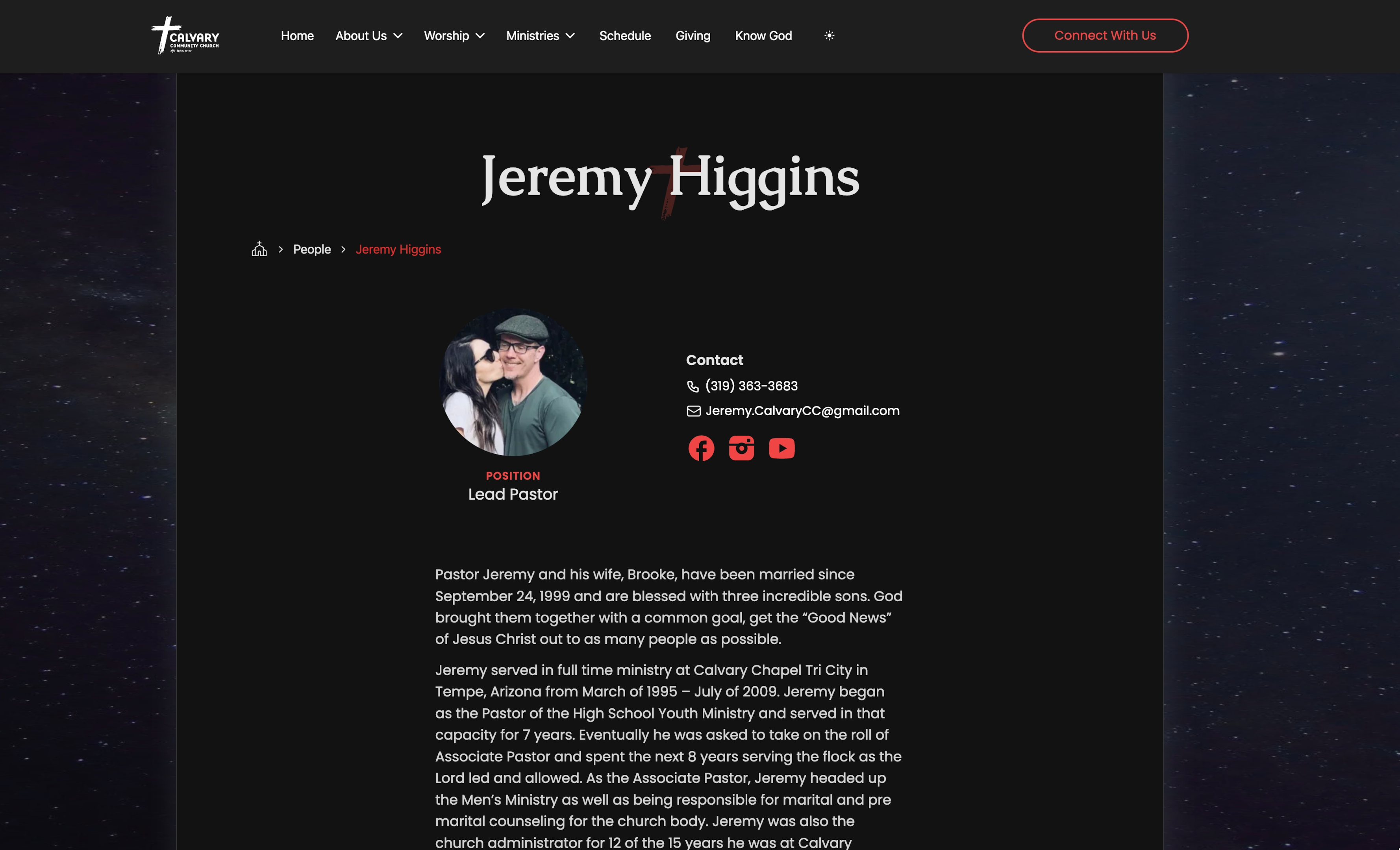
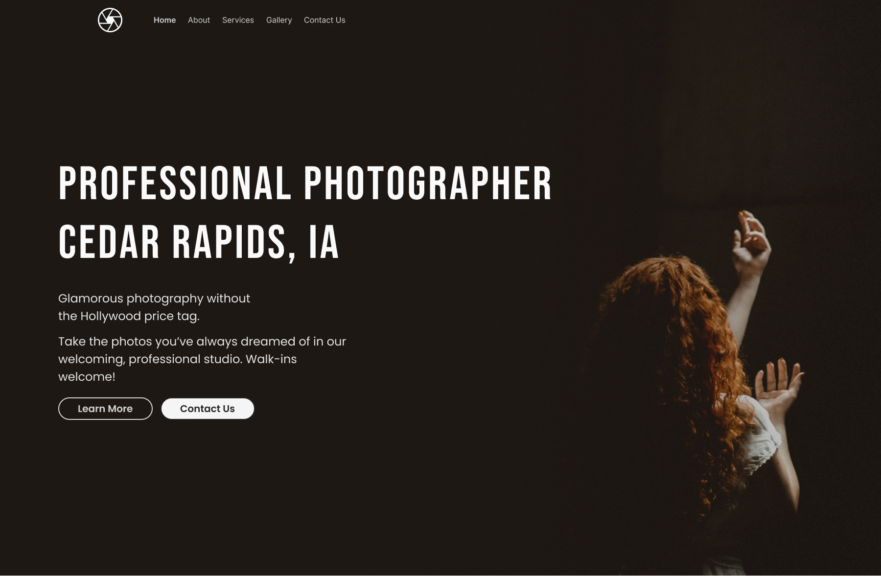
Calvary Community Church

And here is Calvary Community Church’s website in dark mode, which features a black design with a large, cosmic hero image behind it.
In the internal pages, you’ll find more dark-white text on a black background.
Adding images
Choosing the right images for a black and white website is crucial. Any splash of color you add could detract from the theme.
As we wrote here, you can easily search free image repositories like Pexels for images based on hex code.
White images
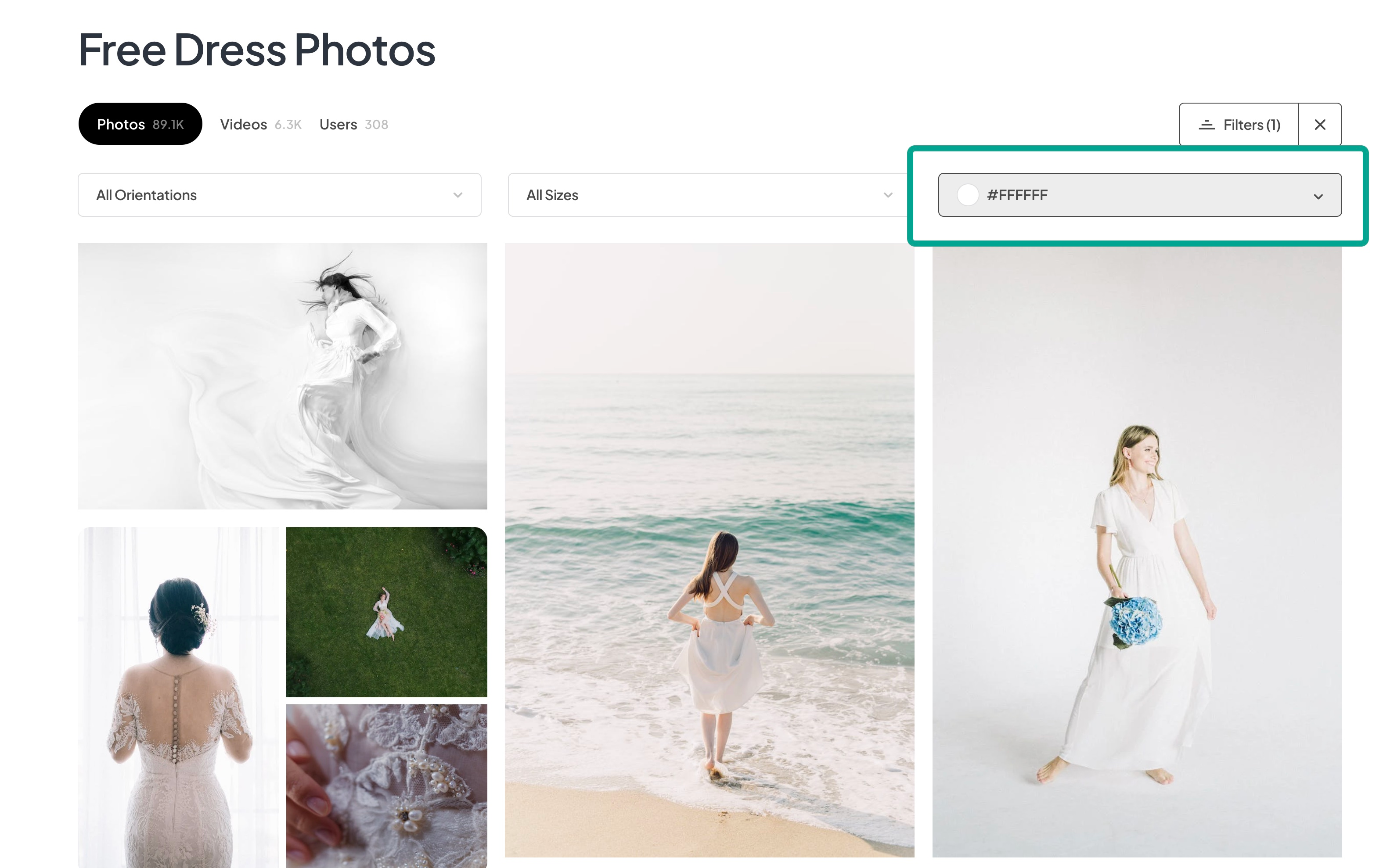
Here we searched the term “dress” and selected the white (#ffffff) hex-code filter.
The first image is clearly the best result. Not only is the dress in the picture white, the entire picture is white.
This would look great on a white website.
Here’s an example of how that would look:

See how the background perfectly reflects the black-on-white style?
As you scroll further through the search results, there are photos that are almost right, but they have a little too much color that would disrupt the design.
The fix? Add an opaque, white layer above the image to lighten it up. Here’s an example of a near-white image (left), and a more opaque image (right) that would better fit a black and white website design.

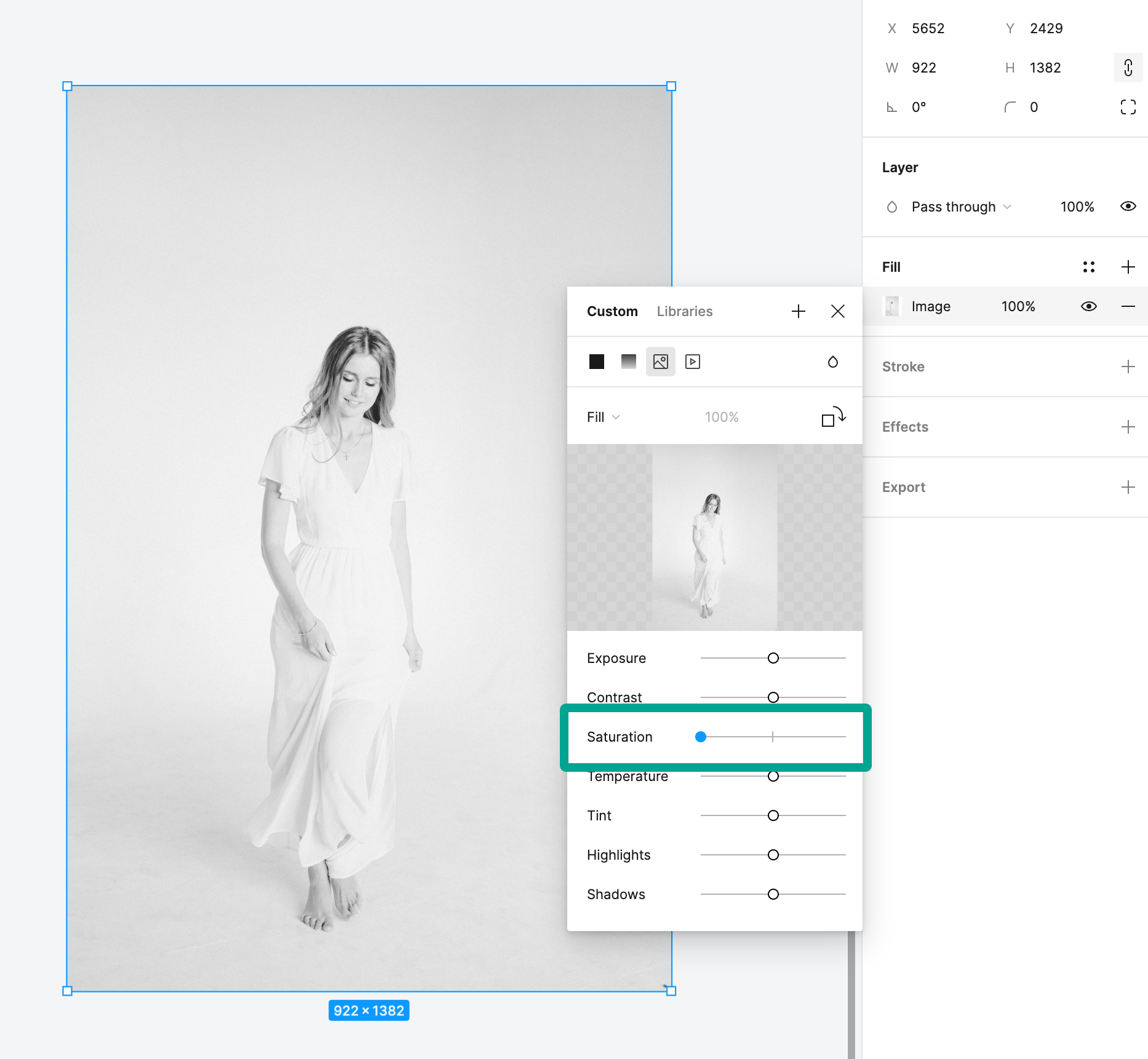
There is still some color in this image, so another trick is to simply convert the entire image to black and white!

Sometimes you’ll want your image to have a touch of color (we’ll get into that later). But most of the time, converting an image to grayscale is your best bet.
An easy way to do this in Figma is simply to decrease the saturation of the image to 0.
Black images
Next, we searched Pexels for the same query (“dress”), but this time using a black (#000000) hex-code filter.
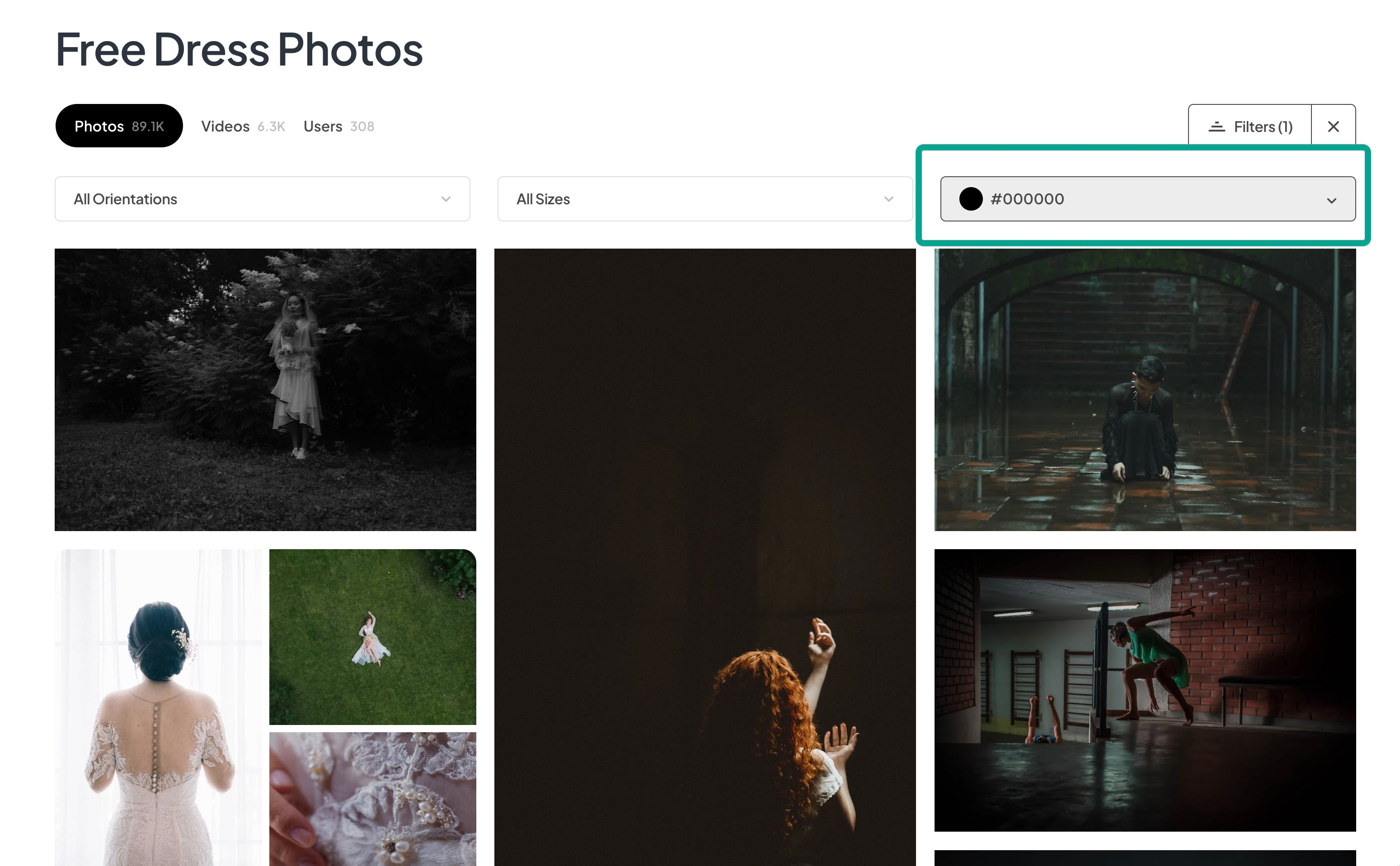
Again, that first image result is the best. This time, the dress isn’t even black, but the entire image is black, which is what we’re after.
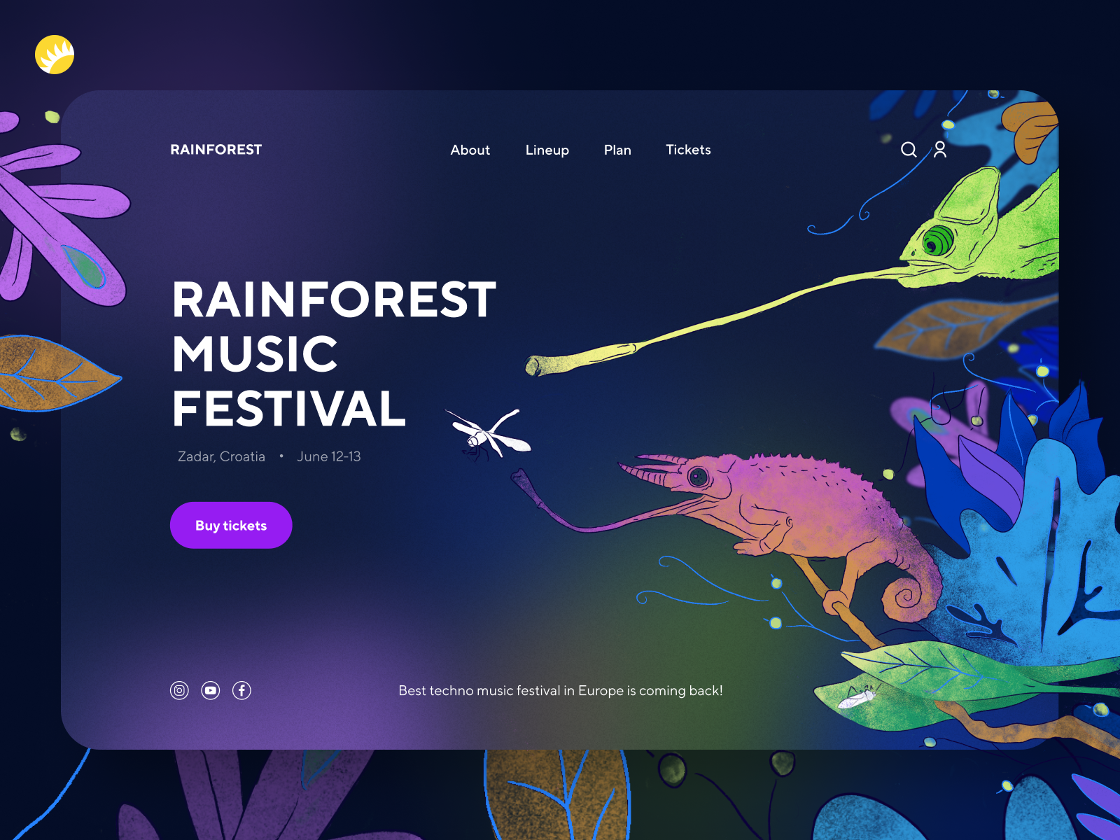
In the second image, we have a splash of color again. This raises the question—should we convert this image to grayscale like we did with the white image above? Or should we leave the splash of color?
Here is the design with the color left in:
And here is the design when the image is converted to grayscale:

They both look good, but the pure-black image took away the spirit that the first design has.
How would I decide which one to go with?
If the primary color for the website (that I will use in buttons and call-to-action items) is orange/red, or otherwise compliments the red of the woman’s hair, I would leave the color in.
However, if the business had their brand identity established with a clashing color (e.g., green), I would opt for the pure black-and-white image.
On that note, let’s discuss adding color to a pure black and white website.
Adding color
Adding color to a black and white website is one of the trickiest design feats to pull off.
Whereas a website that is colorful on purpose can look great…
…it is very easy to start adding too much color to a neutral website. Once that happens, the whole design is pulled apart.
Here’s an example of a black and white website that has too much color added to it.
Too much color added

As you can see, there are several colors which are eye-catching. That could be a good thing, if the colors directed your attention to something important.
Instead, there are irrelevant colors, like the yellow camera icon in the bottom-right corner, which do nothing to advance the user’s understanding of how to navigate the website. Rather, it simply distracts and detracts from the entire design.
Let’s clean this up and try again.
Just enough color added

We made a number of changes here to pull the design together and respect the black and white color scheme.
First, we took the color off the logo in the nav bar. The logo is already in a primary location (which will scroll with the rest of the website) and doesn’t need anything extra to call it out. In fact, it’s better if the logo is “subliminal” in that it is noticeable, but never brought to the forefront of your attention.
Next, we lowered the saturation of the background image and added a horizontal gradient so that it “fades” into the white background on the left. This helps the image “pop” less, which would have taken emphasis off of the text.
For most of your users, the Hero section is your one chance to get your hooks in. If the text isn’t perfect, the user will leave.
TIP
Last, we took away the camera image in the bottom-right corner (what was it adding?) and added a splash of color to the word “Photographer” and the call-to-action button (“Contact Us”).
Now, the only color on the page is the primary color (blue; #075985) and it has a clear purpose—to bring the user’s attention to what the business does (photography) and what action to take (go to the contact form).
Color serves many purposes—it can be used as a branding strategy, or simply give a “vibe” to the website. However, on a black and white website, your use of color should be very judicious and only used to draw the user’s attention to the most important elements that you want them to see.
Conclusion
Black and white is a timeless color combination that, when used correctly, can create a stunning website design and draw your users’ focus to exactly what you want them to see. For easier reading of text, or simply a website that stands out from your “overly modern” competitors, consider a black and white website.
