
The 10 Principles of Good Website Design
by Cedar Studios • 10/25/2023
Web Design
Great design is equal parts creativity and convention. If your website is too plain, your business will be overlooked. Too different and you confuse and alienate your users. You must learn the rules of good design before you can break them. Here is a list of the 10 principles of good website design that we adhere to at Cedar Studios.
The Principles
- 1. Your Design Should Frame the Writing
- 2. Use Whitespace
- 3. Clear Call-To-Action
- 4. Rely on Conventions
- 5. Hierarchy
- 6. Save the Emphasis
- 7. Keep It Simple
- 8. Know Your Users
- 9. Responsive Design
- 10. Natural Reading Patterns
1. Your Design Should Frame the Writing
At the end of the day, we all want our website to do one thing—make us money.
Good copywriting converts your visitors into customers. To that end, your site design should highlight that writing.
Good writing is short words. Short sentences. Low cognitive load.
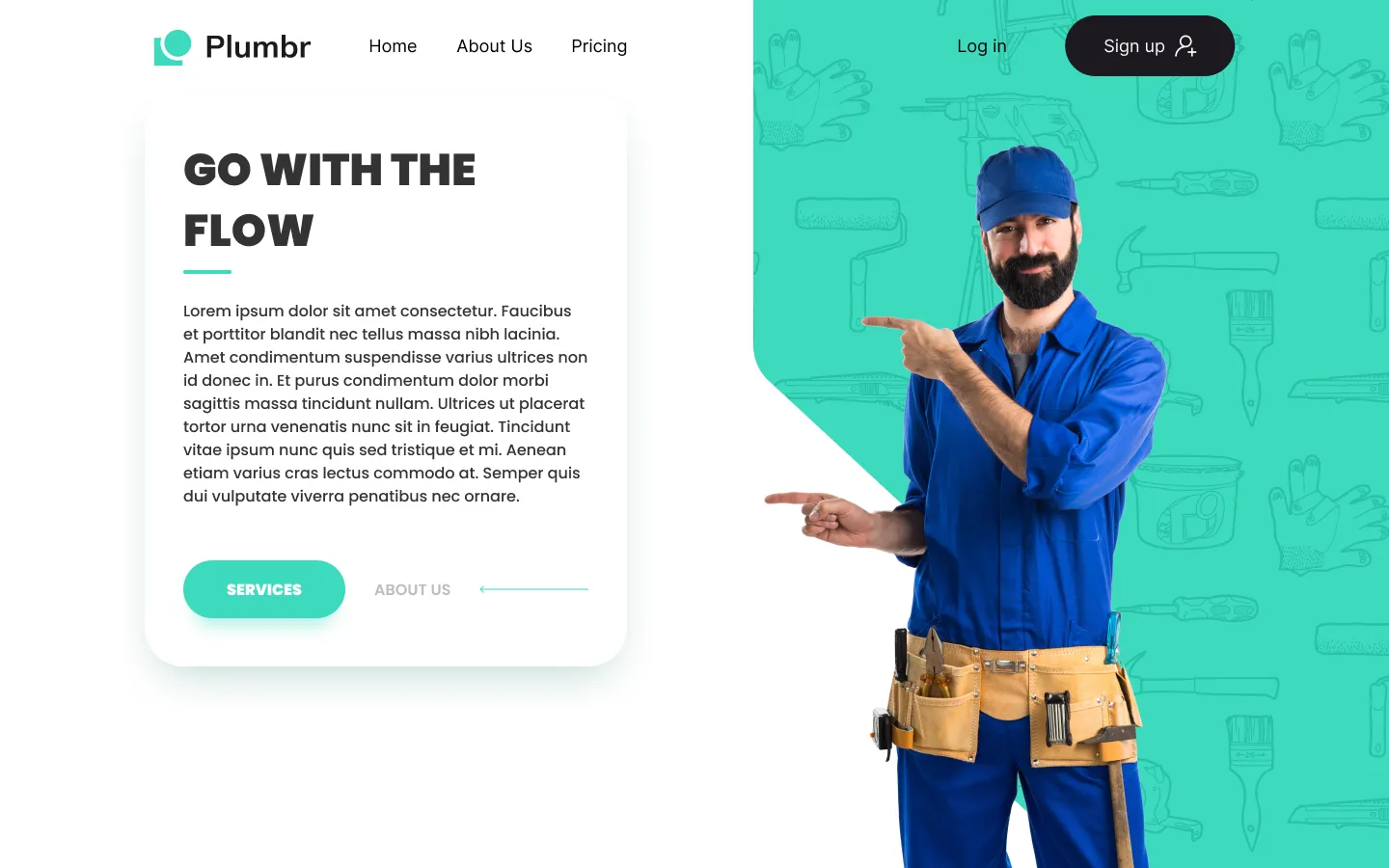
Good website design highlights the most important sentences with appealing visuals. Let’s look at a typical “Hero” section:

This is not a busy design. There is neutral background and a nice graphic on the right. On the left, the most important sentence is big and bold. You know right away what they are selling—tutoring services.
Below, we see supporting text. Following the principles of visual hierarchy, it is smaller and not bold because it is less important than the main hook.
Finally, there is a simple action to take—Find a tutor.
Let’s look at one more example from a previous client of ours.
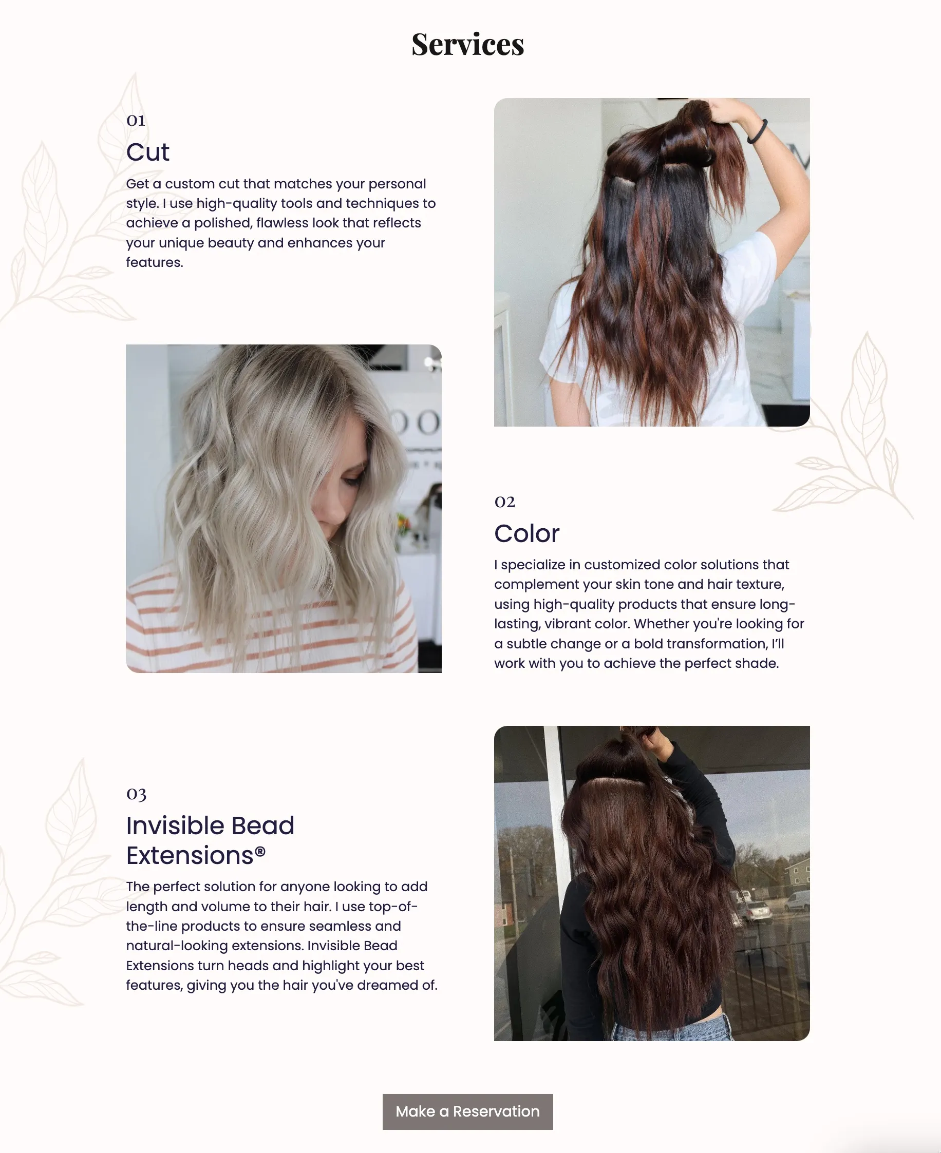
We first notice that there is more text than in the previous Hero section. But, that text is broken up into multiple blocks. Each block has a number and a large, bolded title.
Many users will run (click) away from your website as soon as they see a large paragraph of unbroken text.
Breaking the text up into sections like this reduces that urge and keeps the user’s cognitive load at a minimum.
INFO
Learn more about text-based website designs.
2. Use Whitespace
Whitespace is an important concept in design. What you don’t design is often more important than what you do design.
Edward Tufte calls this the “1 + 1 = 3” rule. Look at the shapes below. The arrangement of the four black shapes create the illusion of a fifth shape:

This concept applies even to music. Radiohead calls this “the space between the notes.”
Apple is a master of using whitespace. Consider the design below for a new Mac computer:
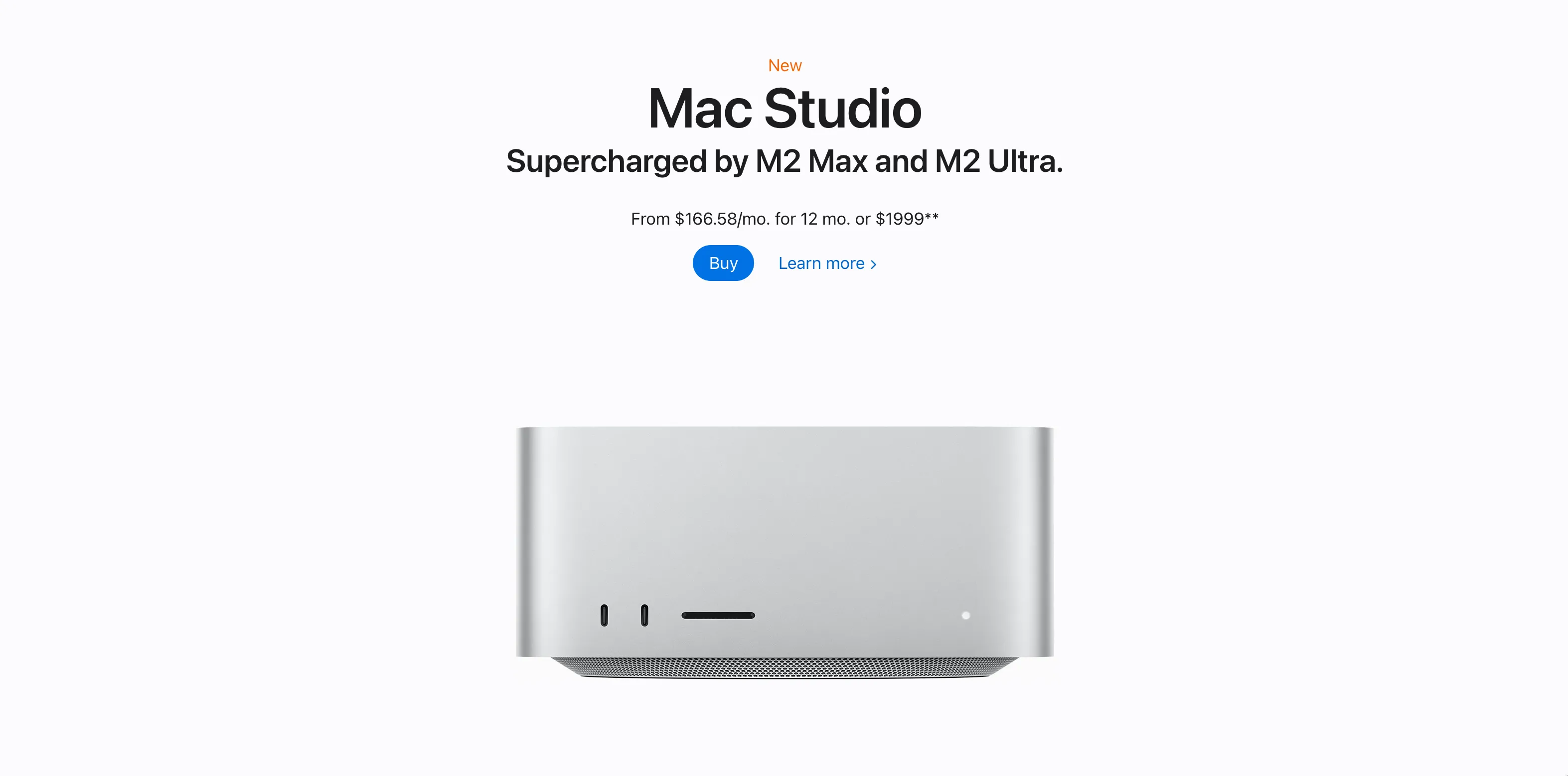
Apart from some necessary text at the top, the high-resolution image stands alone. There is no background gradient, no fancy svg elements floating around. Just the computer and you.
Let your designs breathe by creating whitespace around them.
3. Clear Call-To-Action
How many times have you abandoned a website because you had no idea how to buy the product?
A rookie mistake to overthink and overanalyze your “ask” for your customers. You feel embarrassed to ask your customer to open their wallet and give you money.
(I don’t. Click this link to buy a website.)
In reality, if you are selling something worth buying, your customers want to pay you. They just want it to be frictionless.
Which of these Call-To-Action buttons do you think convert the best?

Almost certainly the ones on the right.
Why?
Because they are clear and concrete.
If I am going to buy a lawn mower, I just want to know how to pay. I don’t want to “make my lawnscaping dreams a reality,” or whatever the overpaid marketing consultant came up with.
Make a great product. Ask for the sale.
Keep it simple.
4. Rely on Conventions
Web designers are constantly trying to reinvent the wheel. It may satisfy a creative itch, but it only frustrates users.
Take a look at two possibilities for our homepage design below:

On the left is a standard hamburger menu button that we have all seen before.
On the right, I moved the navigation button down to the bottom corner and turned it into a map (get it?).
ANNOYING.
You would probably leave the website because you had no idea how to get around.
Always keep Jakob’s Law in mind:
Users spend more time on other websites than on your website.
Users prefer that your site works the same as all the other sites they already know.
5. Hierarchy
Hierarchy in web design applies to both hierarchy of content and to visual hierarchy.
Hierarchy of content
The most important and general information should be found at the top of the page. Don’t make readers scroll.
Your writing will naturally become more specific as you move down the hierarchy.
HTML headers are explicitly hierarchical. If you fire up Google Dev Tools, you’ll see that the h1 header is used for the title of this post. Each section below that (numbers 1–10) are within an h2 tag. This section and the next one are titled with an h3 tag. The tags are numbered all the way to h6.
Visual hierarchy
Visual hierarchy can (and will be) its own blog post. For now, I will introduce the simple concepts:
- Size (or scale)
- Color
- Contrast
- Alignment
- Spacing (or proximity)

Photo credit: www.elleandcompanydesign.com
6. Save the Emphasis
If everything is important, nothing is.
What are you supposed to do on a website like this one?
The website’s primary color—yellow, if you couldn’t tell—is splashed all over the page.
If everything is important, nothing is.
Now look at this website:

The primary color—again, yellow—is now used only once (outside of the logo).
What are you supposed to do?
It’s obvious. Redeem a coupon.
Save your use of color and emphasis for when it really matters.
7. Keep It Simple
8. Know Your Users
Unfortunately, most web designers on Figma, Dribbble, etc create designs that are meant for software companies, not small businesses.
Would you hire this plumber?
Probably not. You would hire someone like this:
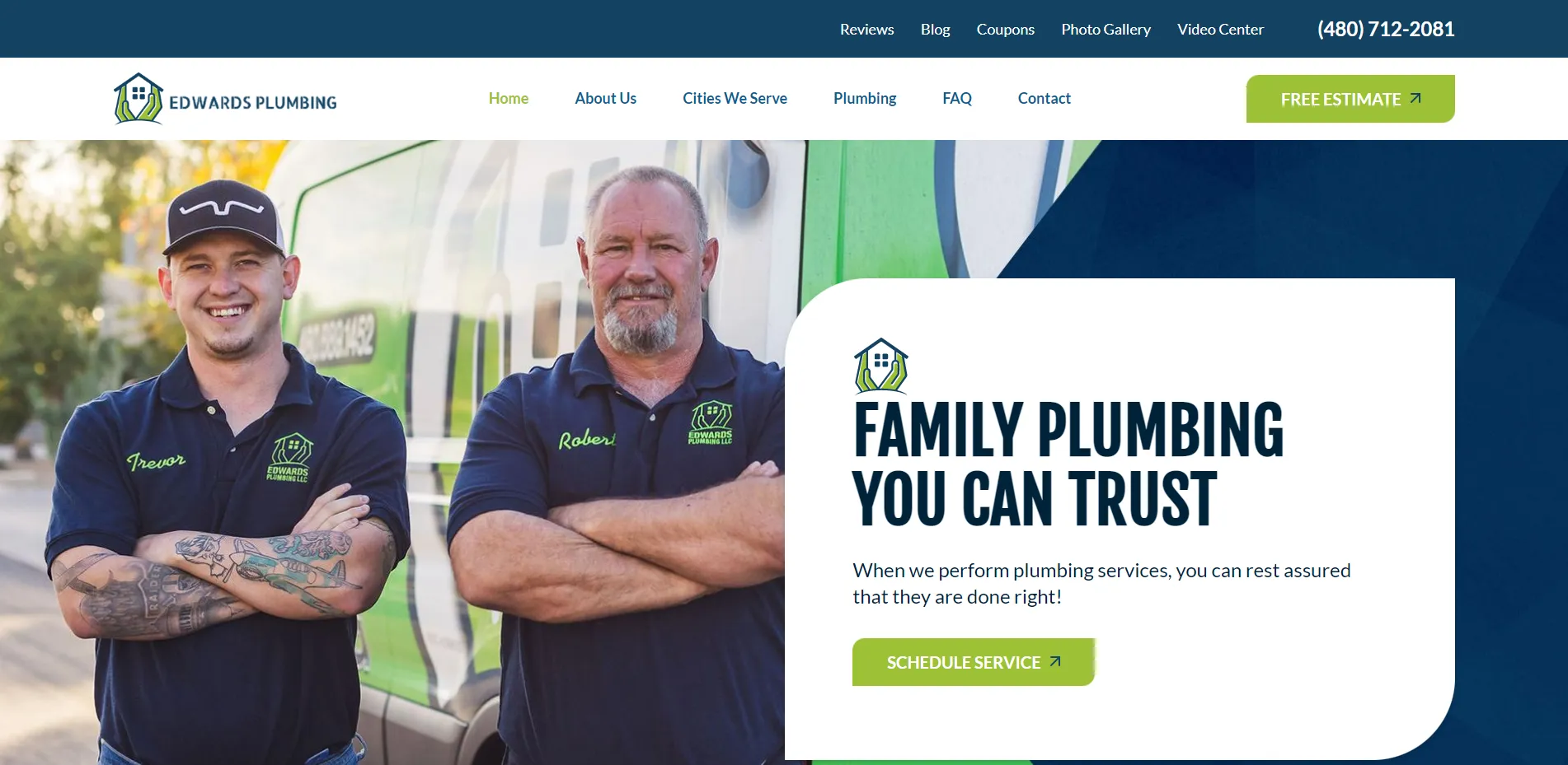
This website could be from the early 2000s. You want a plumber who has been in business at least that long.
Beyond the simple design, there are trustworthy signals such as a picture of a father and son (not some weird model with his pliers facing the wrong way in his toolbelt).
There is also a phone number right at the top, not a sign-in system. (Most service businesses want a phone call, not some weird web platform they have to learn.)
It’s hard to find good website designs for small businesses. CodeStitch is a repository of nice small business designs. In this article we use CodeStitch assets to build a small business landing page in 10 minutes.
9. Responsive Design
Responsive website design is the gold standard protocol for modern websites.
Your website should look good on an old iPhone, a 4k ultra-wide computer monitor, and everything in between.
This is achieved through website development, typically through the use of media queries in CSS:
@media only screen and (min-width: 0px) {
	/* mobile styles here */
}

@media only screen and (min-width: 768px) {
	/* tablet styles here */
}

@media only screen and (min-width: 1024px) {
	/* small desktop styles here */
}

@media only screen and (min-width: 1440px) {
	/* large desktop styles here */
}
As you can see, as the minimum width of the device increases from a phone (min-width: 0–768 px) to a large desktop (min-width: 1440+ px), there should be different code that styles your website.
Here’s how it should look in practice:
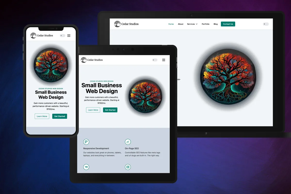
Notice how the mobile website has a vertical design, complimenting the aspect ratio of the device. The tablet website is in a horizontal arrangement, but still retains the hamburger navigation menu button in the upper-right corner. The desktop website has a spread-out navigation bar with direct links visible.
If your web developer doesn’t know about responsive design—run!
10. Natural Reading Patterns
Eye-tracking research shows there are two main patterns people use when viewing a website for the first time—the F-Pattern and the Z-Pattern.
F-Pattern
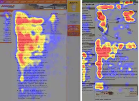
Eye-tracking paths along a website.
When screening a website, most users will start to look down the website starting at the left-hand side.
If a sentence catches the user’s eye, he will start to read left-to-right.
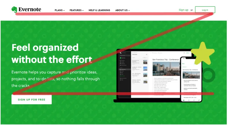
Z-Pattern
Another frequent pattern involves the user scanning the top of the website, lowering their gaze down and back to the left, and scanning the next “row” of content in a Z-Pattern:
Conclusion
Know the rules before you break them. By following these 10 principles for good website design, you can ensure you are building (or buying) a website with a higher chance of converting visitors into customers.
